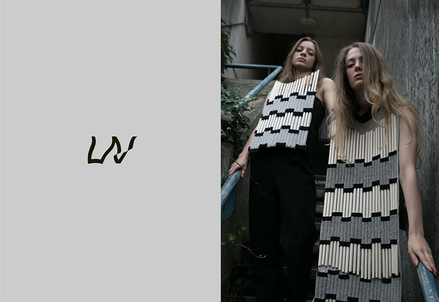
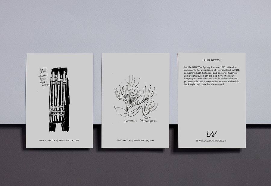
A recent graduate from Central Saint Martins, Laura Newton is a fashion and knitwear designer who takes inspiration from a wide variety of sources, such as art, architecture, and indigenous cultures.

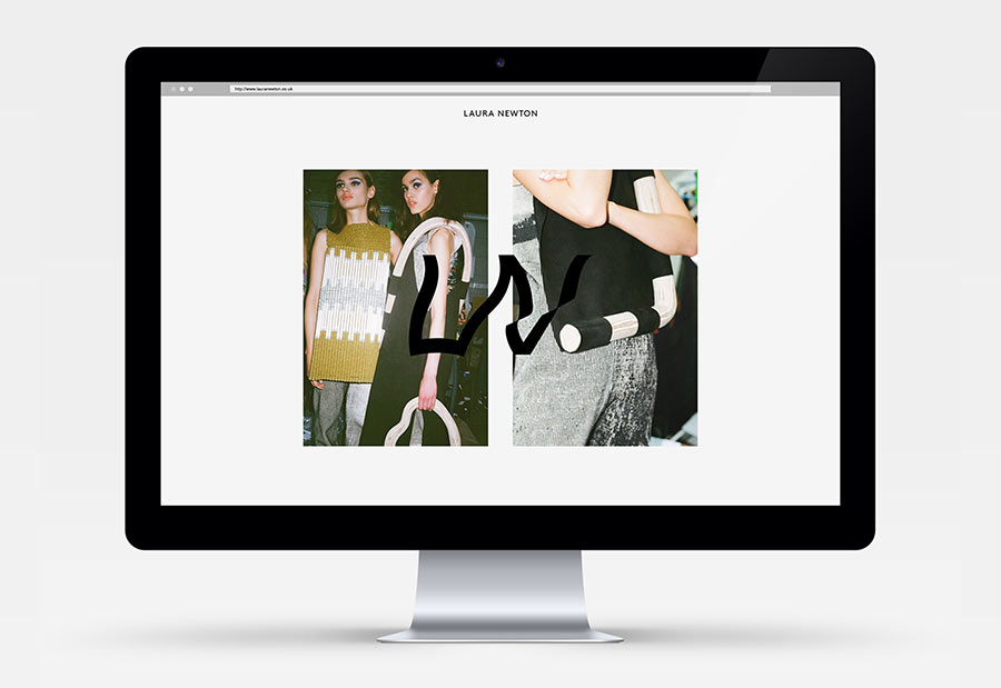
The visual identity was designed in a way that mirrors her process. The tension between ideas is ingrained in Laura’s method of working and is evident in her garments. It’s simple but complexed, geometric yet wavy, sculptural yet comforting. Always experimenting, tinkering and exploring.
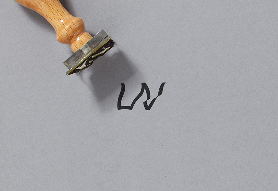


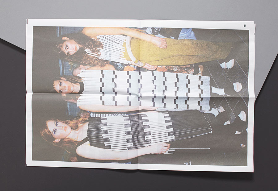
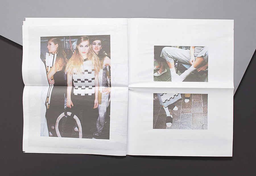
The stamp, backstage photography style, and choice of newsprint for the lookbook was intentionally aimed at creating a DIY aesthetic.


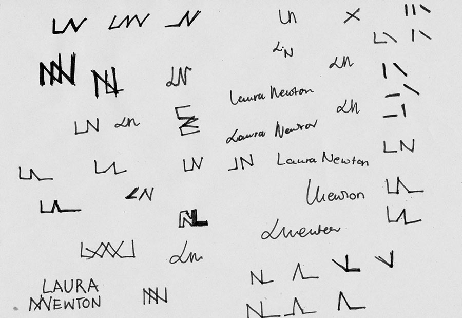
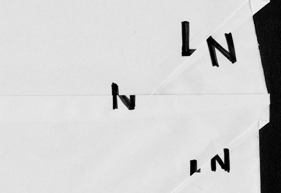
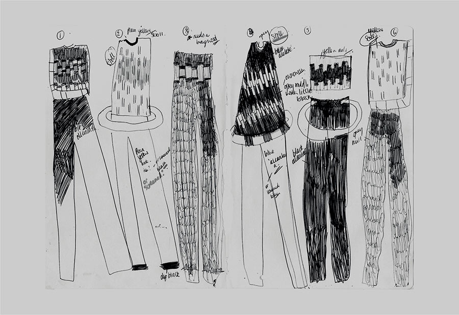
The supporting typeface is based on Laura’s handwriting, working alongside her sketches showcasing the process of developing a garment. It needed to feel as if it came from Laura and wasn’t self-aware.


 Sketches by Laura Newton


Specifications:
Business cards: 85 x 55 mm, printed by Blackeyepress
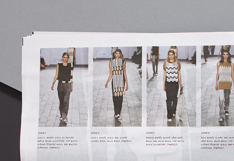
Lookbook: 289 x 380 mm, 8pp, printed by Newspaper Club
Design and art direction: Hai-ku
Photography by Hannah Burton and Laura Newton

More from Hai-ku.

Comments
That’s just brilliant to use the concept of “wavy” fabric to define fashion in the LN logo. I love it plus the personalized font. Very cool.