
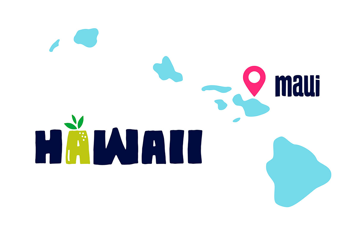
Maui Pops is a popsicle store on the island of Maui, Hawaii. The project was initiated by the development company USAI Investments (Dallas, TX) but hadn’t yet been brought to life. Our challenge was to develop the brand concept and create the identity along with the interior design of the chain’s first outlet.
As we began to explore the task we were attracted to a truly Hawaiian character — Tiki. In Polynesian culture this word stands for different types of idols ranging from wooden ceremonial statues of the Maori tribe to the stone figures on Easter Island. Hawaiian culture has the same roots. For that reason we decided to take Tiki as a key branding element and gave him some delicious and refreshing Maui Popsicles to taste. It was a love at first bite!

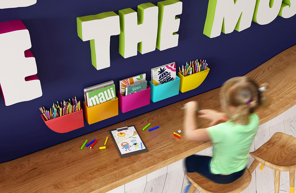
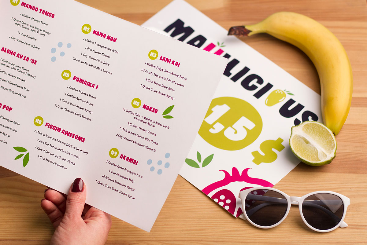
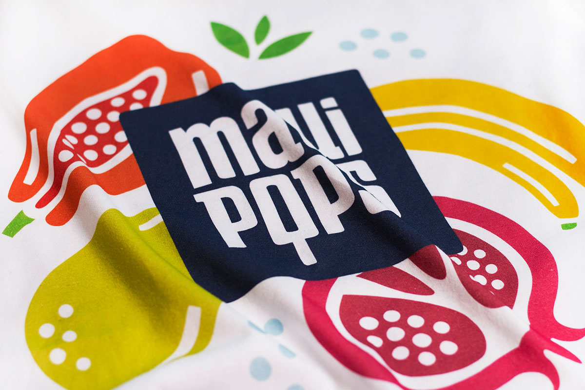
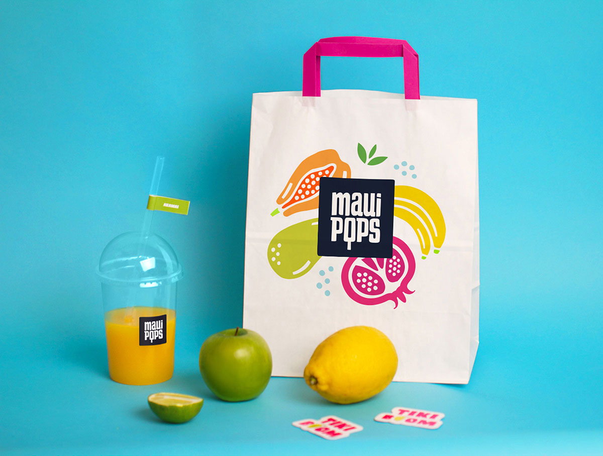
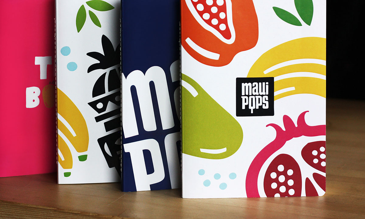
The brand identity was developed in conjunction with the interior design — the core idea is a mixture of ethnic motives in a contemporary look and a colorful palette to suit the bright Hawaiian spirit. The style started growing into something fun, with new fonts and other graphic solutions being added.

The main Maui Pops character — Tiki — meets the visitors inside the shop. He is a part of a phrase that combines words with symbols. We’ve added juicy fruit signs that demonstrate the variety of popsicle flavors. And the exit is through the gift shop as usual! We made three heights of chairs for kids of different ages and for grown-ups. The counter has an unusual shape that suits all chair sizes and makes the interior a little more dynamic.


The studio’s work elsewhere on Identity Designed: Palestra.
View more from Brandon Archibald.


Comments
B-E-A-Utiful!
Very nice work!