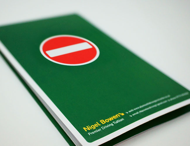
This identity project is for driving instructor Nigel Bowen, whose USP is his reassuring, calming approach, putting nervous learners at ease with his disarmingly friendly banter.
Our brief was to deliver a brand identity and communications idea in one, ensuring it defied all the usual generic visual codes and didn’t involve a picture of a car or a torn learner plate!
The plan was to use Nigel’s name as the brand — he’d built up a reputation over the years and a lot of his new business came from ex-pupil referrals.

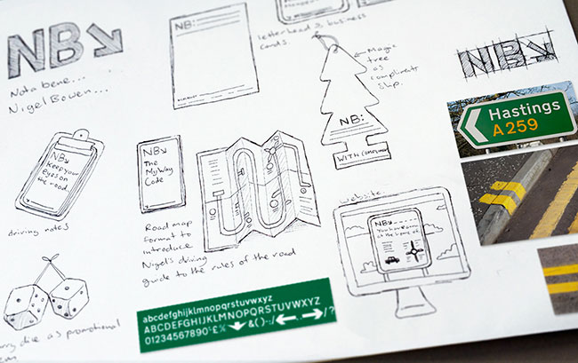
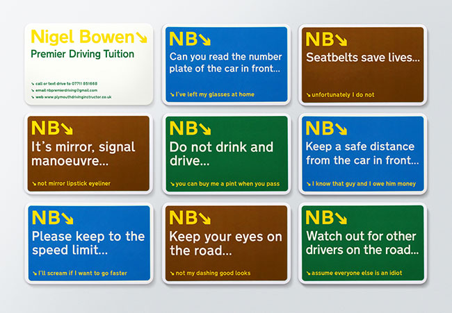
We proposed using his initials as the lead. It meant the equity in his name was protected and at the same time allowed us to have a memorable and emotional “vehicle” to build the brand around.
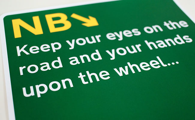
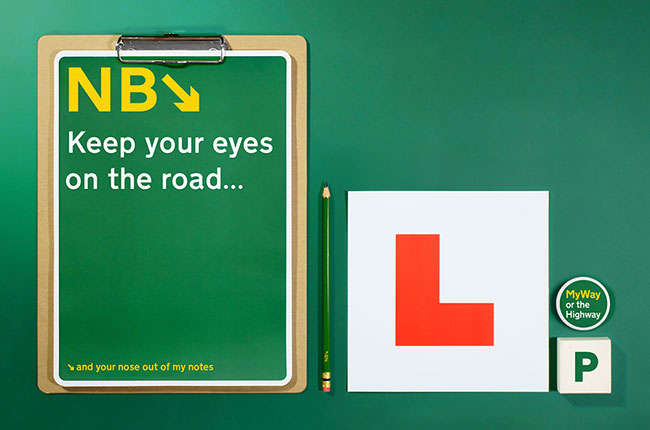
The new identity uses the NB acronym throughout to frame all of Nigel’s genuine one-liners and words of wisdom. The playful content and language was a way of demonstrating how he brings a level of emotional engagement and fun into this ordered framework of practical instruction.
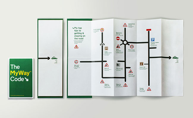
It’s given an active role in all the executions directing the viewer around each brand application as an instructor guides his pupil.
The acronym also works as a subliminal message encouraging the viewer not to forget his name!
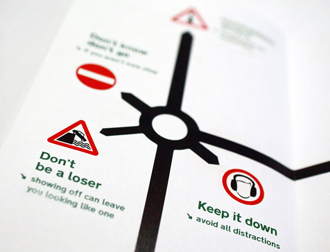
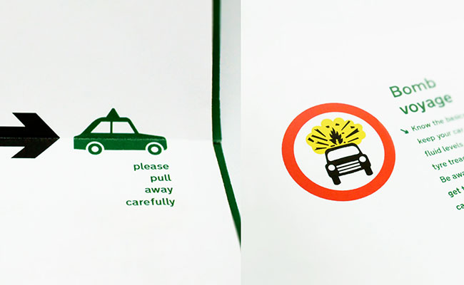
It’s all brought to life in a visual style that’s rooted in the language of motorway and road signage. The colour palette utilises those of UK motorway signs and the font throughout is Transport designed by Jock Kinneir and Margaret Calvert as part of their work for the Department of Transport. This was chosen to lend authenticity to the creative theme and it’s tone suited the directive and instructive nature of his service.
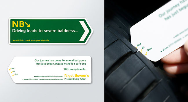
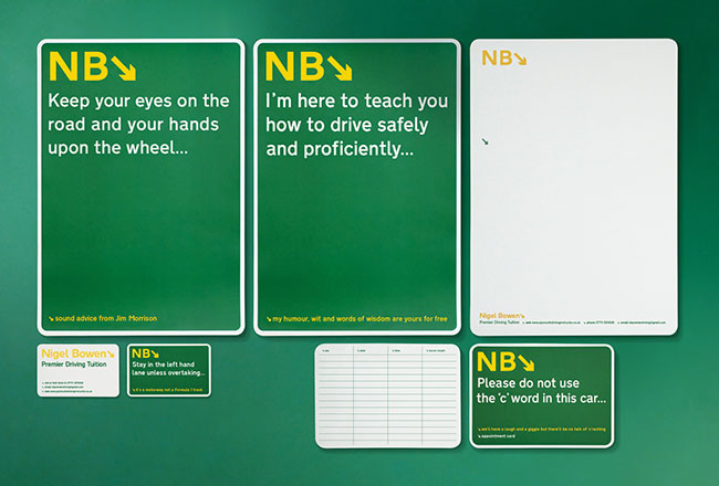
The compliment slip doubles as a tyre tread checker that new drivers can keep as a useful tool as well as a reminder of Nigel’s business details.
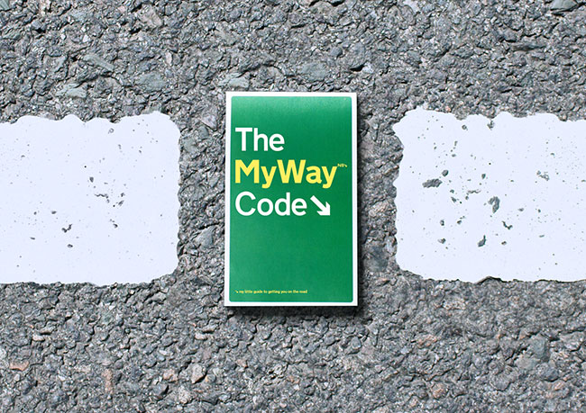
The ‘My Way’ Code leaflet is his own guide to getting on the road as well as being a more universal expression of his positioning and offer in the market place: his own unique approach & philosophy on learning to drive.
More from Afterhours.

Comments
This is fantastic :-) Very refreshing and original, possibly because I don’t think I’ve ever seen a branding project for driving tuition before.
Always nice to see some wit in the copywriting.
I’ve only just noticed the smaller text below the business card headlines! (The wit) Brilliance.
Love it! Witty and cheeky at the same time.
Brilliant!
Apart from being a unique concept and beautifully designed work, this post is also an excellent learning resource as well. I am so inspired that I feel myself fully loaded with a new energy to work better and achieve quality like this in my next projects.
Please keep posting and keep inspiring fellow designers like me!
Lots of thanks.
Regards
Ashwani
Really nice color, a unique and eye-catching brand identity design.