![]()
The Donkey Sanctuary is an international equine charity, recently rebranded by The Allotment.
This project began nearly 12 months ago and has culminated in a new identity and proposition based on the charity’s core purpose — “selfless care and devotion” to mules and donkeys worldwide. The charity treats more than 400,000 working mules and donkeys in 28 countries every year. It also has a number of sanctuaries and foster partners in the UK and Europe which provide care and sanctuary from neglect and cruelty for over 5,000 donkeys. The most famous of these is based in Sidmouth, Devon, and attracts nearly 250,000 visitors per year.
Paul Middlebrook, managing director of The Allotment, explains the background and challenges of the project. He said, “Within the charity sector, naturally there is some cynicism around the value contribution that brand agencies can make in terms of helping a charity achieve more. There’s a fear that change will be associated with unnecessary costs, which may in turn alienate a passionate and loyal donor base. These fears mean that any proposed changes need careful consideration and close collaboration with all stakeholders; from volunteers through to donors and employees. The Donkey Sanctuary was no exception to this. However, extensive research around the chosen brand identity versus the existing identity showed an overwhelming support for change. Stakeholders understood that the current identity no longer effectively expressed the personality and mission of the charity. It also lacked an emotional appeal to the younger donor segments, which are critical to the long-term sustainability of the brand.”
Mark Cross, brand and design manager for The Donkey Sanctuary said, “This is a significant change for our organisation and will create huge value. Research has shown that only 5% of brand decisions are made at the rational level, while 95% are made based on a sub conscious, emotional response. As we go forward our new, more emotive-based brand will help us to raise the consciousness of potential new supporters and allow us to communicate more effectively with existing donors.”
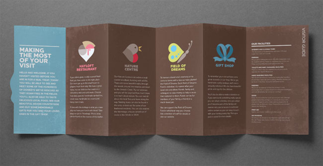
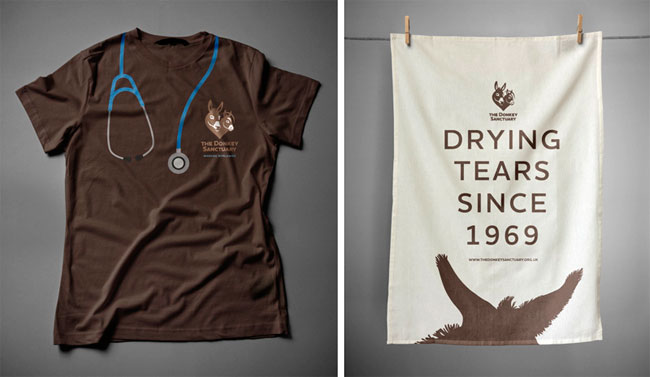
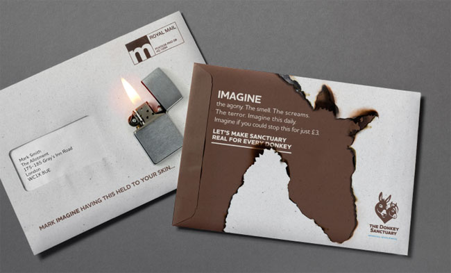
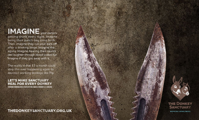
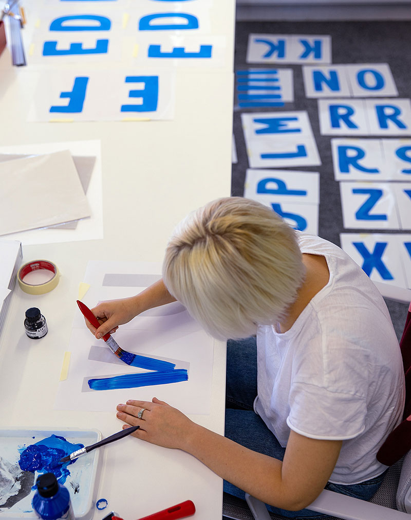
The new brand has now been launched and was featured on this summer’s donor campaign. This has been designed and produced by The Allotment who have also developed comprehensive guidelines for all touch points, from livery, to signage, to visitor destination iconography, to gifts, through to direct mail and donor campaigns. The website has been re-skinned and will be launched later in the year.
The Allotment’s creative partner, James Backhurst, provides some insight into the thinking behind the brand. James said, “Because The Donkey Sanctuary is an international charity we wanted to reflect the palpable ‘care and devotion’ of its supporters in a way that would be instantly understood regardless of language. The new proposition – Selfless Devotion and new identity have created a strong and emotionally connected brand.”
Results:
76% increase in donations for July/August 2012 compared to the same period in 2011.
56% increase in merchandise sales for July/August 2012 compared to the same period in 2011.
69% increase in revenue from a seasonal mailer as a result of the rebrand.
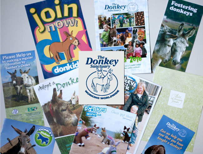
Here’s the old branding.
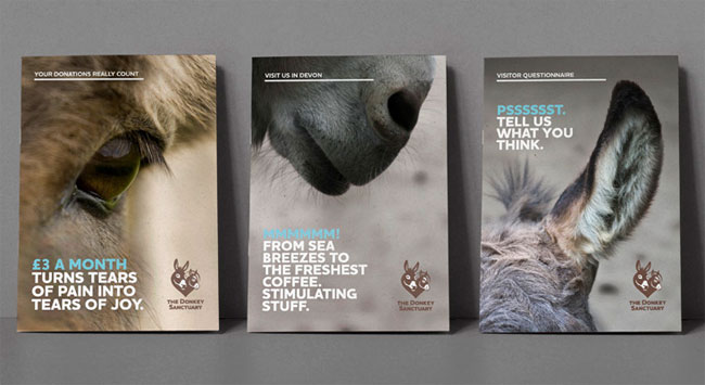
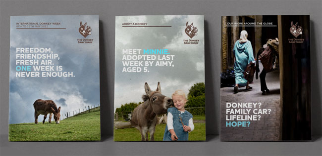
And the new.

![]()

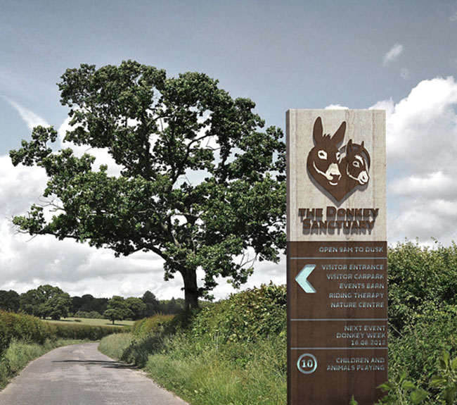
As well as being a charity, The Donkey Sanctuary is also a free visitor attraction, pulling in over 250,000 visitors in Devon since it opened.

More from The Allotment.


Comments
This is fantastic! Their exploration of the subject matter is inspiring. Thank you for finding this and sharing!
The heart/donkey logo works well and the identity really comes to life in the applications. The ads and overall messaging is spot-on. Clever stuff. Really nice work again from the Allotment guys.
I’m not sure if i’m a fan of the logo, the type is nicely set but the mark is a little cliche. Having said that the overall execution of the other material is fantastic…. Really clever..
I really like that. Very fitting and lovely execution.
I like this a lot, too! From colours to typography and from the heart-shaped icons to the applications, everything fits together well.
Clever stuff. More great work on show here.
It is a definite improvement with added coherency but then any conscious identity design would have addressed that. Very average/everyday – nothing to right home about in my opinion in terms of the idea and overall aesthetic although what is produced is extremely well executed.
Lovely, looks like it was a fun project to work on, with a client who had the confidence in the designers, the only downside is the logo.