
Rio Cello, in its 23rd edition, is a classical music event that invades the streets of Rio de Janeiro with art, music and dance. The repertoire of the music promotes the encounter between classical and popular in contemporary concerts of cello, choro, jazz, tango, and rock.

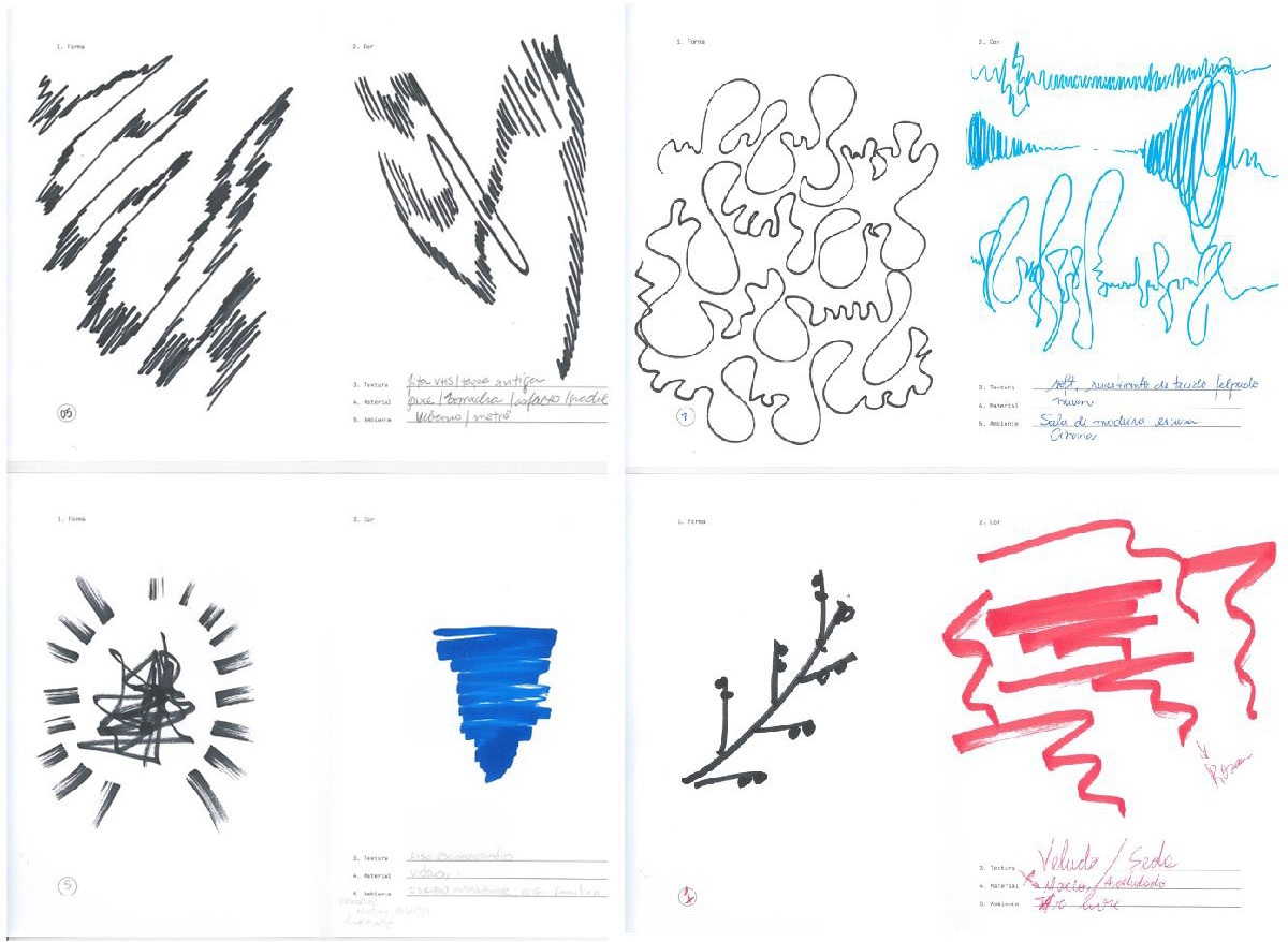
Its visual identity was created with experiments that enriched the process and gave meaning to what we’ve done. The circular shape was born of the geometry of the instrument, which reacts to the music vibration, forming the graphics of the identity.
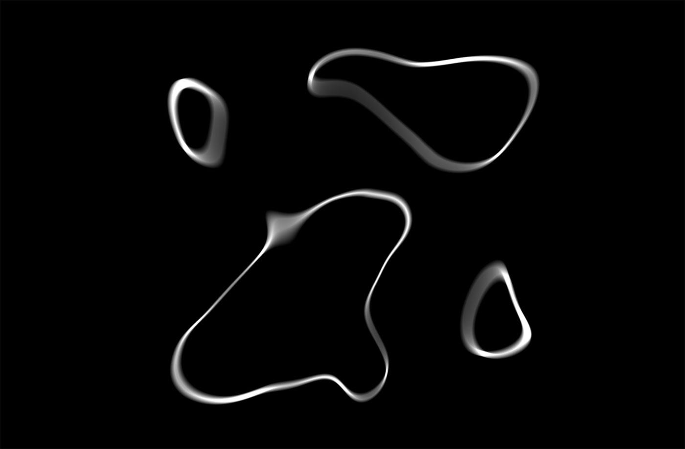
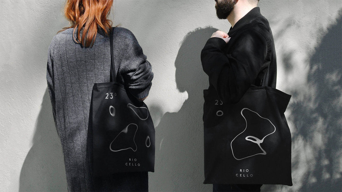

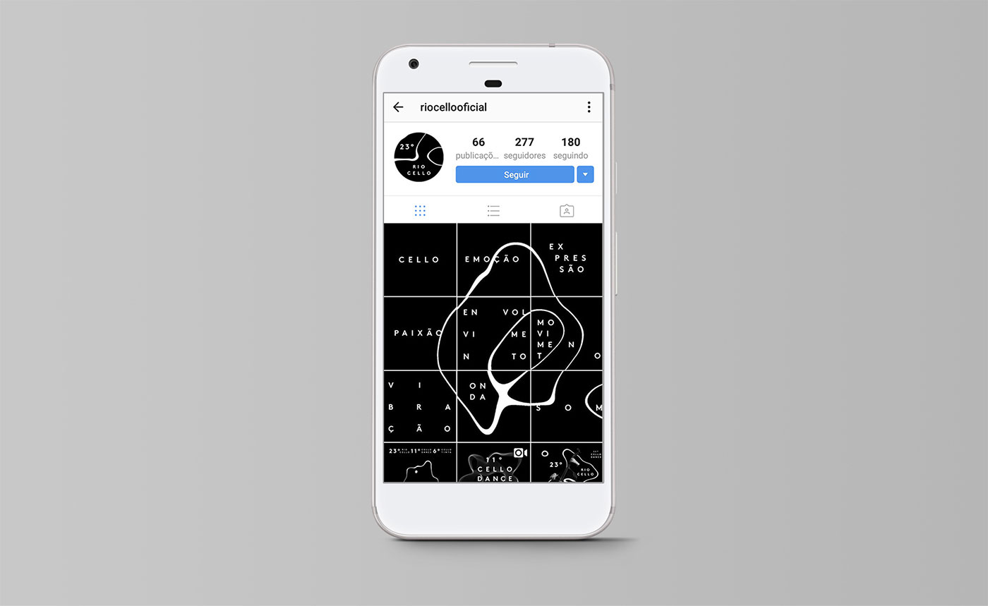
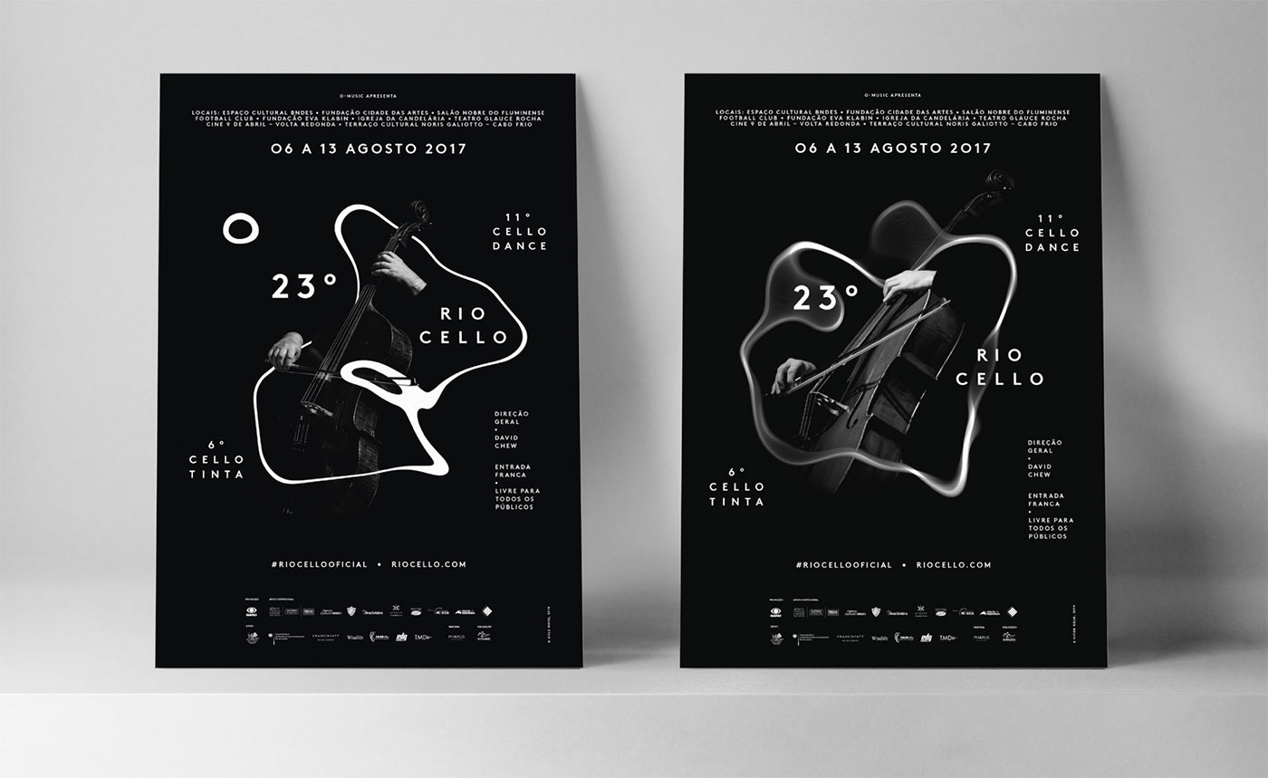
With that, the movement was the essence of the path we’ve developed, in a simple and powerful way, able to bring erudite music close to the current days.

More from Pharus.


Comments
This is so awkwardly close to Happy F&B’s work for GoteborgsOperan.
I don’t think so.
I don’t think so, either. They’re both lovely identities, based on different ideas.
They don’t, and I agree, they are both real cool.
I think they’re pretty different even though they share a similar concept. They’re kind of the opposite of each other.
I don’t think so either.
Concept is similar with using sound vibration to create form but GoteborgsOperan is better.