Sankara set Glazer the challenge of combining the business values of an international five star luxury hotel, with an authentic African flavour.
All parties agreed this could be a delicate balancing act and, in particular, that an over-emphasis on local imagery could overwhelm global ‘business’ perceptions.
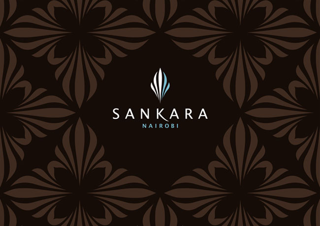
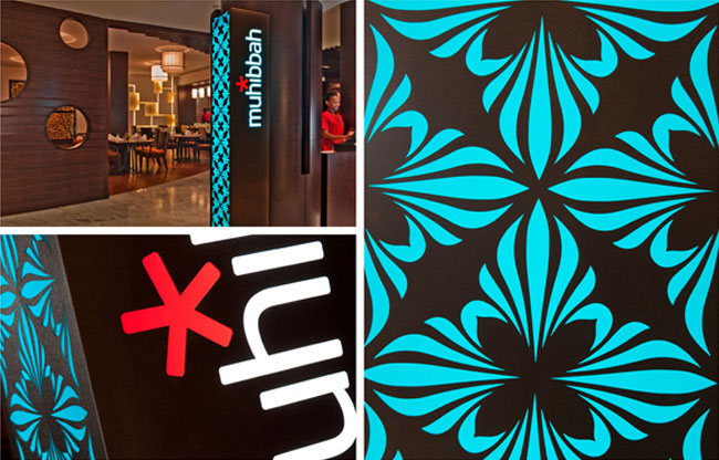
Our design solution flowed from a brandmark evolved from a zebra’s face markings that created a symbol of international stature but with African roots.

![]()
![]()
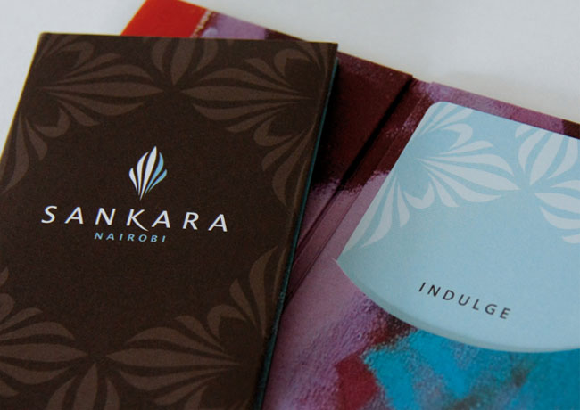
The brandmark was adapted to create Sankara’s own distinctive luxury pattern which was used as a key element of the branding alongside a luxury colour palette of dark brown and white accompanied by a vibrant turquoise.
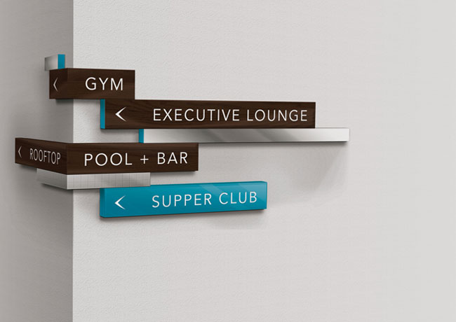
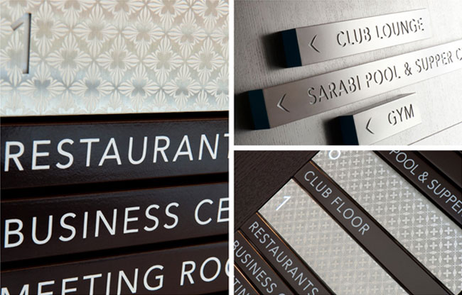
These elements were carried onto the design of literature and merchandising materials as well as informing interior design and a comprehensive signage system.
Local artwork was sourced and used as a vivid complementary element on selected designs, reflecting the vibrancy of Nairobi itself.
The result is a successful fusion of global and indigenous styles which sets new standards for Africa.


Following the branding project, Sankara Nairobi earned a listing in Wallpaper and Fortune magazine’s best new business hotels as well as a coveted spot on the Condé Nast Traveller Hot List — being acknowledged as one of only 65 ‘extraordinary’ new hotels and resorts around the world.
The creative work also won a World Luxury Finalist Award in the category of branding and visual identity. The awards, held in Monte Carlo with an international jury from 10 countries, focus exclusively on luxury brands and recognise the very best of creativity in luxury design.
More from Glazer.

Comments
The concept, colors, and overall execution are on point. Animal prints can be a bit tacky but Glazer did a really great job at taking just the right amount of inspiration from the zebra pattern.
Beautiful. Loved the sketching process.. It would have been a little more informative if you had explained a little about choosing the (beautiful) typeface. :)
This is a project with a wide scope and I find the solution very convincing and professional. If I had a chance to talk to the designers I’d ask them about two aspects from the photos: The signs at the corner for “Gym”, “Pool” stand out with an alignment that is not repeated elsewhere. I also find the red in the neon sign not otherwise present in the color scheme. The chosen font seems timeless; not going with all caps would given the signs a little more character for my taste but I’m sure this was considered.
I went to Nairobi back in ’93. Very nicely captured and refined finished product. Love the process involved.
Love it! I think the pattern looks its best on the floor wayfinding etched into the brushed metal.
Super concept! Well thought out and applied!
This is outstanding, it works so well, and very importantly – I really think it’s going to stand the test of time.
The animal pattern is executed very professionally and gives a somewhat exclusive (slim lines) and global (many lines together) feel. Furthermore the colours match really well together, and the overall branding inside the hotel looks wonderful.
Like Christian mentioned, there are, however, some elements that don’t seem to match/go with the brand design.
As I write now am at sankara, the African ambience and the creativity is to behold.
Perfectly done. I admire the process, the steps it took. ❤️
Great! I am interested in having a logo designed for a luxury real estate company dealing with coastal, oceanfront, beach properties. Palmvillle Real Estate