
Artéria is a premium leather accessories brand in Brazil that sells to people who care about the origin of their products as well as their functionality. Therefore it had to be something new in a traditional Brazilian leather company environment. The fashion design duo from Artéria approached us with a project that was not fully developed and without any pre-made products, but with many concepts and a lot of imagination.
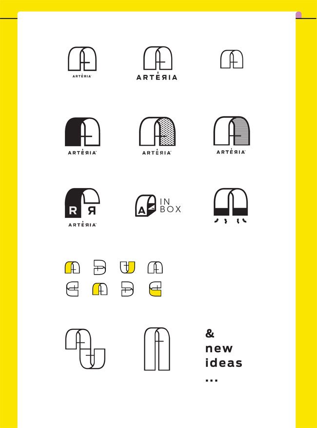
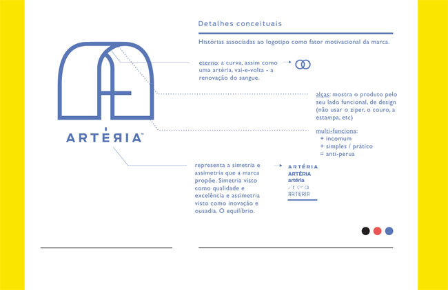
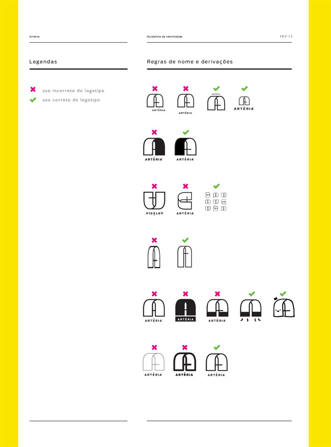
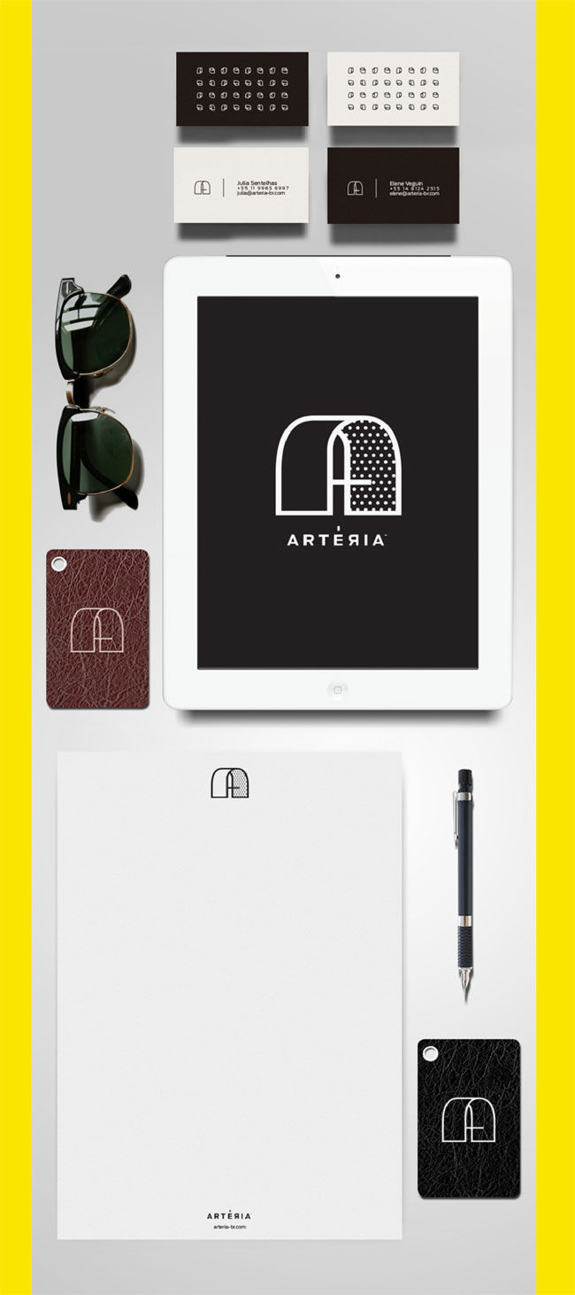
As usual, the logo needed to represent some of Artéria’s values, but the right decision was to highlight what they were selling — the bags. It was clear that the commercial issue was really important, so we created the logo as an allusion to the bag’s handle. Additionally, other meanings were attached to it, such as the A letter, the symmetry and durability, a feature enhanced by the name. Each meaning was totally in harmony with a simple and functional logo.

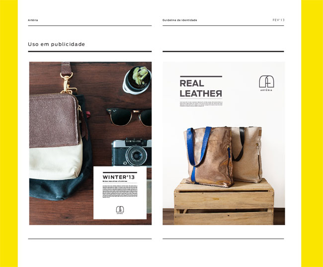
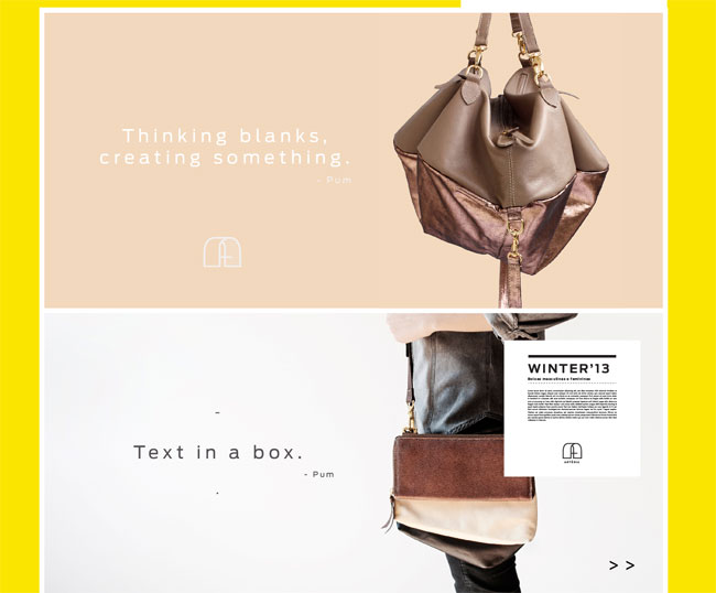
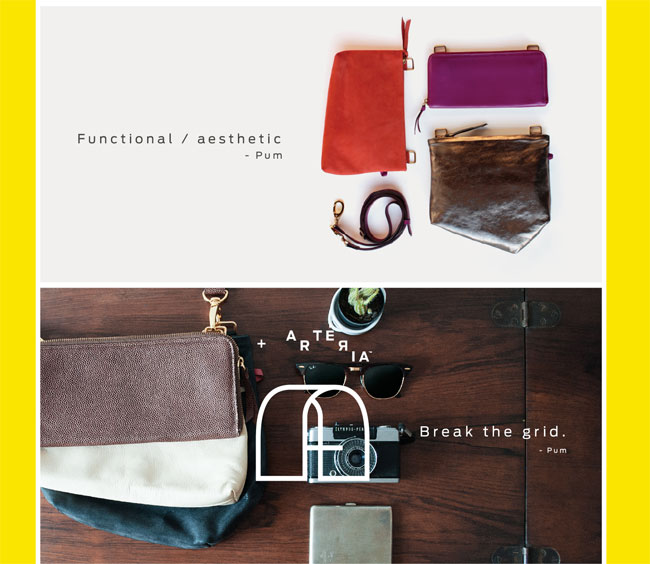
Our research became so important to the brand that the “simple and functional” thing was now a value that commanded other details. The photographic direction and website worked perfectly in a low-budget project where, for example, a catalog could not be shot outdoors.
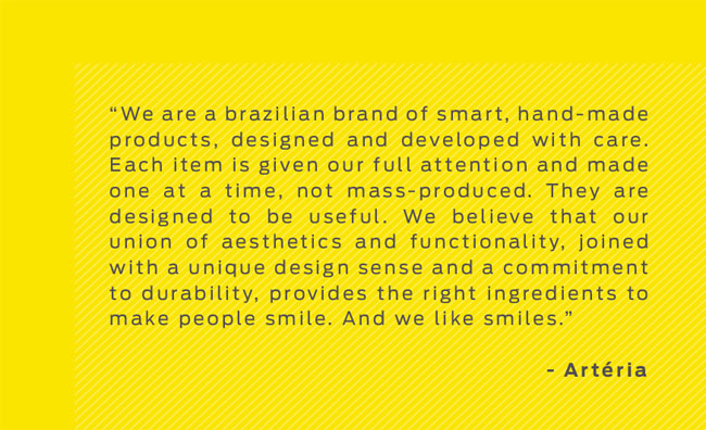
Artéria became a brand of smart, handmade products, designed and developed with care. The products are designed to be useful because the duo believe in the union of aesthetics and functionality, joined with a unique design sense and a commitment to durability that provides the right ingredients to make people smile.







More from Pum.



Comments
This is a comprehensive branding. Given the scope of the project I feel that the logo could have been explored deeper. At least for me it lacks a sense of luxury, refinement or sophistication that I see in the leather products. It emphasizes a geometric or constructive aspect that is at odds with sophisticated products that are not meant to be modular, unlike a shelf or storage system, for example. To sum it up: the logo emphasizes an aspect that I don’t see in the product and that I feel is not the best possible match. The Toys-R-Us logotype adds to this feeling, I am sorry.
I disagree, it’s the contrasting styles of the modern/geometric logo vs the natural/leather products than make it sing. The approach is unexpected helping make it a contemporary brand. Nice work.
I feel the branding for this is spot on. The A shape definitely helps bring the feel of the real leather together. The font choice is modern and fits well together with the A (arch?). Which reminded me of a how a bag appears if you look at it straight on sitting on a table. I agree with Duncan with the approach being something unexpected and to me that results in a brand that can stand on its own and be successful.
I’m probably over thinking this: what is the purpose of a bag? To hold something. The logo suggests a cover or roof. For it being a handle it is uncomfortably wide. Furthermore, a handle needs to hold something but it isn’t clear what that would be. The connection with A for Artéria does work, admittedly. I don’t think that a logo must have a specific or obvious meaning but the designers set out to achieve this: “the right decision was to highlight what they were selling — the bags. […], so we created the logo as an allusion to the bag’s handle.” I don’t think it works on this level, it might still work on others as pointed out by Josten and Duncan.
Christian articulated well the feeling toward the work that I had. Everything about the graphic work gives me a sense of clean geometry while the essential concepts behind the brand seem intent on emphasizing the presence of a human hand. The constructive and modular qualities of the branding that Christian noted do seem to be at odds with these ideas. ‘Unexpected’ is often a great quality to strive for, but why in this case does it seem to detach the product from the brand rather than bring out some kind of underlying harmony? The mark and its variations are an aesthetically appealing direction, but not one that seems to me to be effective in this context. As well, the type choices seem poorly considered, including that very awkward backwards ‘R’.
I think that removing the ‘roof’ on the ‘A’ to create an open frame rather than a curved sheet, along with removing the crossbar from the middle of the ‘A’, would complete this icon. It would be much more suggestive of bag handles if approached like this – and would become less fussy, which would better suit the luxurious nature of the products. There seems to be too many overthought and unnecessary features within the logo. Refine these and let the identity have little flare instead.