
A few months ago, we came to El Al’s offices and received a particularly challenging task: to build from scratch a new airline brand in Israel. We were already excited. Building an airline brand does not happen every day, certainly not in such a small country.
Today, we are excited once again, and even feel like we are ‘up in the clouds’ because everything is ready and all that is left to do is take off.

Background
El Al is the leading and preferred brand in the Israeli aviation industry; however, in recent years it has dealt with aggressive competition against other traditional international airlines, Israeli companies and low-cost players who have started operating flights to Israel.
The main reason for the Israeli community’s preference of El Al is the strong feeling of safety that is also tied to high standards of security, national pride, and a connection to the Israeli nature. In light of the increased competition in recent years, one of the main barriers for El Al has been the perception of expensive pricing.
‘Low cost’ is the most developing and growing concept in global aviation. In Israel, however, this field is still in its infancy: operations are still limited in the number of operating companies and the number of destinations. The Israeli community, which is known on the one hand for flying frequently and on the other for being “price biased”, is not yet familiar with the concept and does not understand the differences between low cost companies and traditional airlines.
The challenges
The first challenge: an opportunity to launch a new concept in Israel’s aviation industry and to take ownership over it.
The second challenge: the need to launch a model of operations that is significantly different from the familiar model of El Al, all without damaging a brand that is well known and loved. A model that includes a minimal flight and service experience alongside a new pricing method: purchasing one-way tickets at a base price and paying separately for any additional flight service.
The third challenge: defining a real differentiation against the direct competition, mainly based on low prices offered by other low cost companies, who have international reputations and experience.


The solution
The first decision we made was to build an independent brand (with a unique identity and a differentiated holistic experience) with a link to the El Al brand, that being associated with it constitutes an integral part of its differentiation in the category. The positioning defined for the brand is inexpensive flights from a good home.
Additionally, in order for us to properly market the concept of low cost in Israel and take ownership without only addressing the cheap price, the branding essence that was chosen emphasises substantial and relevant value for the target community: “allowing you to choose.” This approach lets the brand tell the real story behind the low cost concept, namely the modular pricing model that constitutes, among other things, the reason for the cheap pricing. This approach allows the brand to create a unique story against the direct competition.
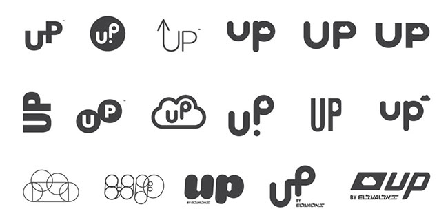
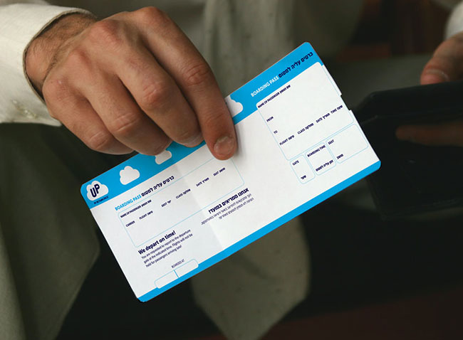
In order to maintain a certain link to El Al, at the same time as transmitting a separate energy, we chose the name UP for the brand, a name that correlates with the meaning of the name El Al.
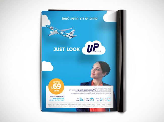
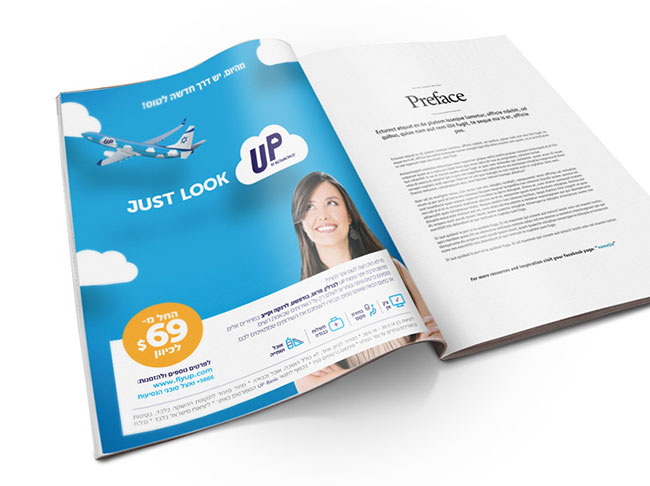
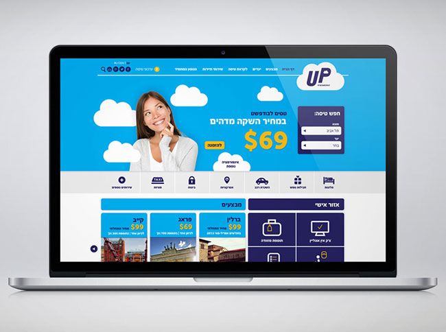
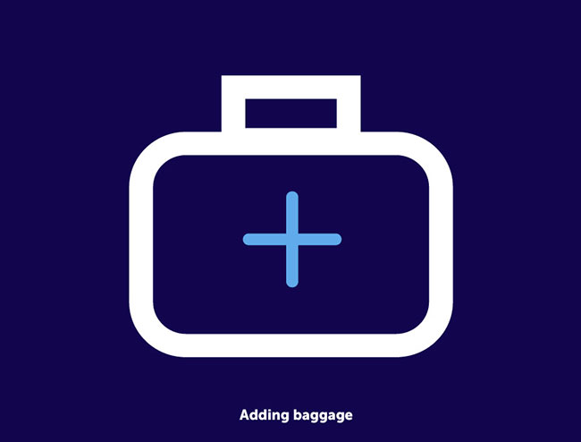
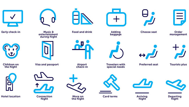
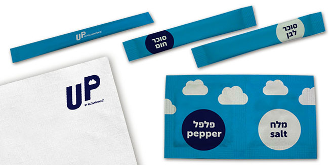
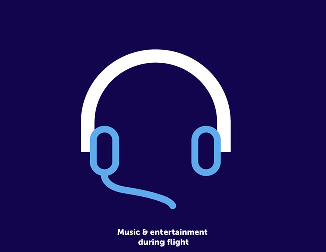
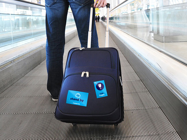
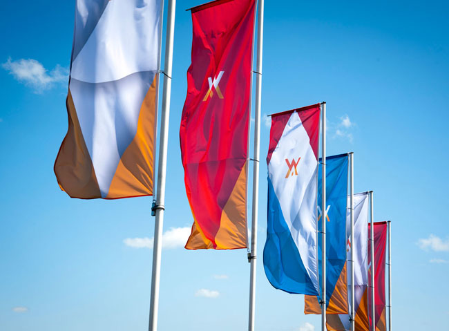
The brand language that we developed brings typical characteristics of low cost brands, alongside certain anchors maintaining the link to the umbrella brand and characteristics emphasising the brand essence — The Choice. That’s how we chose the main colour to be light blue and the clouds to be the main brand tool. We also developed series of unique icons for each chosen flight service, and created a unique design for the brand’s aircrafts that keeps the country’s flag on the tail.
We are proud to launch UP — the low cost brand from the El Al family.


More from Open.


Comments
The video is great, it has to be super to see your work fly! Best regards, Katcha.
As a particular fan of airline branding, I saw this not long ago and was impressed how well executed it was, especially considering what unholy inconsistent dated mess El Al’s mainline communication can be. They’ve also done quite well with integrating the Hebrew text with the whimsical feel of brand – not always easy in non-latin scripts as options can be quite limited.
This was a very well executed branding.
I love how the “P” in “UP” is elevated to imply a “upward” movement.
Lovely work, well executed.
The same plane icons as the arrivals and departures from my city: http://www.airport-poznan.com.pl/en/
Besides that it’s very good branding. Well done.
icons inspired by KölnBonn Airport much?
http://www.toanvuhuu.com/uploads/pics/KBA-Piktogramme-uebersicht-0.gif
This is such a striking design! The brand is catchy with its Up pointing ‘up’ and I like the ‘Up to you’. I think this will appeal to kids as well as adults! Thanks for sharing.
I thought some of the earlier drawings for the logo had much more potential than the chosen route. I think the cloud ‘in’ the ‘P’ is a bit much. I would have had the cloud as a brand element rather than part of the logo also.
I do like the icons, really like the adverts and the colours in general.
It’s funny I did a quick up logo, just messing around that looks similar to some of their earlier drawings :: https://twitter.com/Graphic_Design_/status/460439348287406080/photo/1
I thought that, too, Adam (about the negative space cloud in the P), at least for when the brand name already appears inside a cloud.
I seem to be in the minority in not really liking this. I agree with Adam and David about the cloud within cloud design, and I’m also not a big fan of the P being higher than the U.
These elements add to the feeling I get that it’s trying a bit too hard to be fun and friendly. I just want a plane to get me from A to B in one piece without making me feel homicidal, not to be my best mate, so there’s a bit too much whimsy for my taste.
Although I think the icons have been executed decently enough, without the title underneath I’d struggle to understand what they mean, which makes me question their purpose. In particular, I would think ‘choose seat’ would be ‘window seat’, ‘preferred seat’ would be ‘extra legroom’, ‘early check in’ would be ‘online check in’, and ‘tourist plus’ would be ‘add another passenger’. I wouldn’t get the meaning of the bear and the ‘card terms’ looks like it’s a sign for a court room.
The food packaging is also a bit vague. I don’t read Hebrew, so I’ve no idea what the long thin packets are. I’m guessing they’re sugar and maybe creamer, but simple images would clear it up.
Sorry, but I can’t shift the idea that trying to convey low price has come off as looking cheap.
I would be a bit freaked out to fly on a plane that has graphics of blue sky and clouds on it… probably a stupid thought, but when I’m up there I want to make sure every other plane sees me.
I hear you Richard.
Not a fan of the mark at all, it almost seems like they have tried too hard to be ‘fun’. I feel as though the clouds illustrated in this way is cliché and gives the brand an unprofessional / unpolished feel.
I do love the iconography and the poster design but feel it’s wasted with the mark.