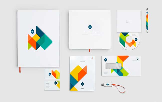
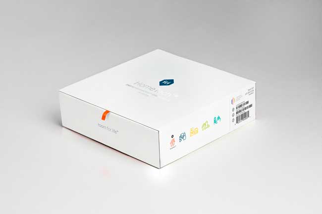
ITI is a pioneer in automation technology, solving everyday challenges in all parts of life. With a clear strategic focus, ITI is making better life-quality everywhere — in private life, corporate buildings, public space and healthcare. The brand communication Heydays developed for ITI is built upon the business idea itself. Making everyday tasks easier for everyone, ITI’s visual program is summarized in the slogan “Room for life.”
![]()
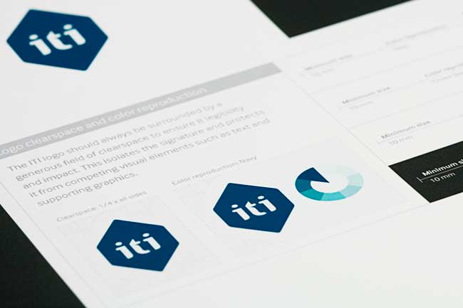
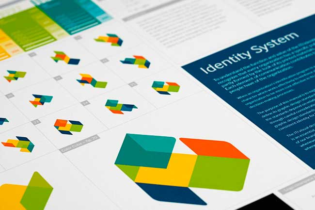
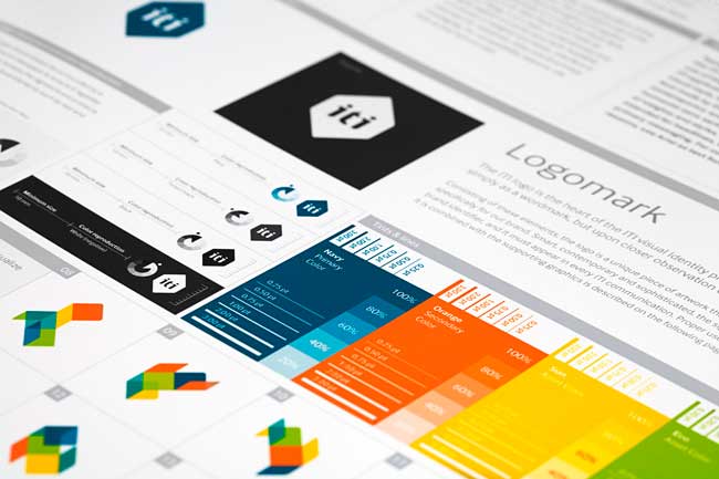
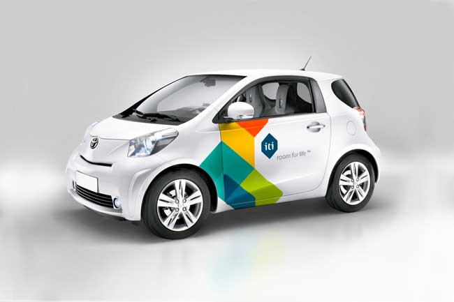
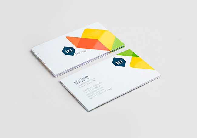
The logo can be seen as just a flat artwork, but can also be seen as a cube felt with colors. The multicolored supporting graphic illustrates the logo folded out, and comes in a number of different versions. This communicates both the adaptability of the system, and life taking different directions. Appearing different on every surface, the visual expression is a representation of life, freedom and possibilities. The color palette is optimistic and brings energy to the brand. Heydays established their core values and developed a full visual identity program and slogan.
More from Heydays.

Comments
Wow! I love these colors and shapes.
A well documented visual identity program, great brand manual, love the fresh approach to the the use of colors and the animated use of the shapes, communicates well its flexibility and energy.
I’ve always loved identity systems that vary from piece to piece. Always changing and organic but maintaining unity. A true sign that it is successful.
I find myself staying locked into the logo itself to define all aspects of an identity. This reminds me that there other forms that should be considered outside of the logo mark that can breathe unique life into each piece of the system.
Thanks for the post, David.
By the way, I need to snap a photo of myself with LogoDesignLove and send it over. Great idea!
Awesome work! I like the completely design of the ID manual and the chromatic selection. Great article!
Lovely work. I’m with Phil and really enjoy a mark that is organic – which this definitely is.
Well crafted solid dynamic identity how it should be done.
Maybe a bit on the safe side (client?) and I am definitely not sure about the logo (type)….
really nice interpretation of the “over-print transparency” concept. nicely done indeed!
Beautiful identity. Absolutely love the package design.
This identity takes me days back when I read a great article from Paul Rand in which article there was this extract which says: “Design is the method of putting form and content together. Design, just as art, has multiple definitions; there is no single definition. Design can be art. Design can be aesthetics. Design is so simple, that’s why it is so complicated.
In my opinion..this logo sums up this great statement coz it ticks all the boxes. ” great work”.
Really? No one else see’s the Cooper Union or VCU Brandcenter identities here?
Hi Stein,
Amazingly well thought out identity.
Just a tiny snippet of the kind of work you do as I can see from your website.
I particularly like the way you give an explanation of your rational behind typographic and material choices in your portfolio. Kudos.
Hello, and thanks for all the comments. They are all valued and highly appriciated.
David: Thanks. We were made aware of the Cooper Union identity via Twitter a few days ago. There’s no need to hide the fact that they are very similar in both shape and colours, allthough they vary in terms of idea and underlying concept. I belive the two identities were developed around the same time as well. These things will happen from time to time, and luckily the two firms are not competing or in any way branch related.