
Patricia Coffee Brewers in Melbourne is owned and run by best mates Bowen Holden and Pip Heath. Bowen had been thinking about Patricia for over 13 years. He may not have always known her name, but he knew that his passion and devotion to coffee needed a home.
Our workshop with Bowen and business partner Pip revealed a need to avoid an accepted, and overtly complex, coffee list offering — they wanted to serve it straight: black, white or filtered. The cookie-cut Melbourne coffee shop would thankfully be scrapped for an ethos driven by simplicity and attention to detail — that’s Patricia Coffee.

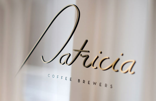
Our naming sessions resulted in the adoption of Bowen’s grandma’s name, Patricia, leaving all other clever word-play to fill the cafe in different ways. We’d set the tone with a classic hand-crafted logo guilded on the front door’s window, but then tuck it away, only allowing it to occasionally grace the takeaway cups or tags. A broadly spaced Neutra typeface would come to the fore everywhere else, originating from the hand of a deco architect and typifying the period. Neutra would also take the leading role on some beautifully functional letter-pressed coasters, perforated to transform into business cards and labels.
On the premises
As far as we know it was originally a lawyer’s office. The entire building has recently been completely renovated (at the same time as Patricia was being built) to accommodate small law practices and individuals.
On the style of design
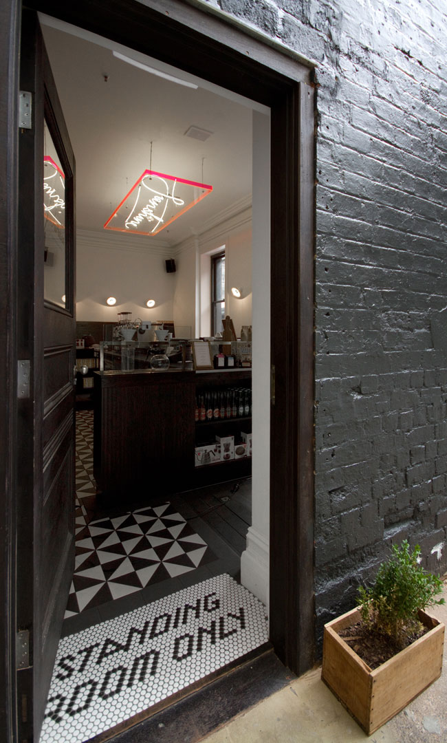
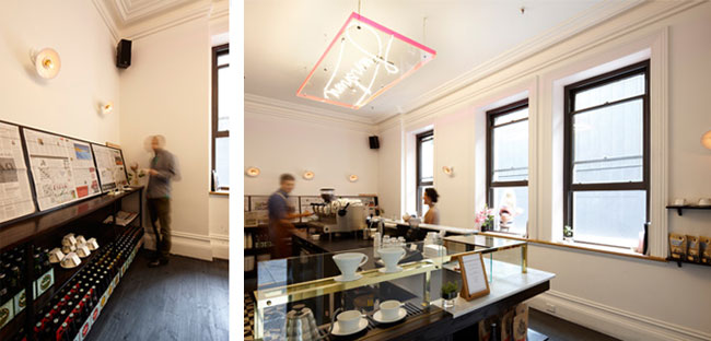
We approached the brand with reflection to functional elegance. The style is driven by simplicity and attention to detail, stripping elements back and not cluttering the space by ‘over’ designing. We wanted to create a memorable experience for the patrons — part of this challenge was not to simply put a ‘Patricia’ logo on every part of this journey. We solved this by creating a range of graphic devices and simple intriguing language (‘Sunshine’, ‘Standing Room Only’ etc.) that were part of the identity, including the custom overlapping border and varying logotypes.


On special materials
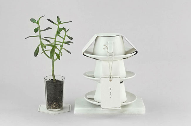
From the beginning we worked closely with the interior architects at Foolscap to make sure our choice of materials was inline with the overall aesthetic of the cafe. For instance, an unbleached boxboard was chosen for the coasters that perforate to become business cards.


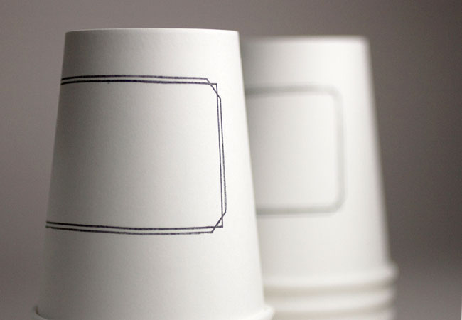
This material is both aesthetically pleasing and functional. We also came up with a clever way to package the cups Bowen sells at Patricia by simply utilising a long rectangular piece of paper folded around the cup and saucer to secure the objects together.

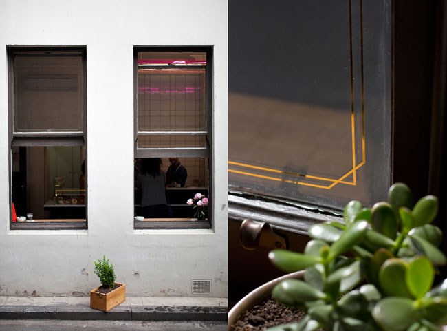
For the main menu board white rubber bands were sourced to hold the A1 size paper to the board. This detail was also implemented to hold sheets of newspaper against the custom built sideboard at the back of the cafe. The frame marque appears as gold guiding on the windows, another subtle detail that quietly ties the branding together. This is an ongoing collaboration as we are currently designing a range of bespoke packaging for their takeaway coffee.

On the uniforms
They are smart and classic with a neutral colour palette that ties into the aesthetic of the venue. The key feature of the uniforms is the leather aprons that are not only functional but in keeping with the character of Patricia.

On the star of the show
Coffee is the star, and was the main reason why Bowen started Patricia. It’s served straight: black, white or filtered. Food is available but limited to a small range of fresh cakes, pastries and donuts.


On the Patricia vibe
The vibe is youthful, fun, and warm. It’s unpretentious and customer-focused which all ties into Bowen offering a product that is honest and made with care. No detail is spared or overlooked.


Beyond the Pixels is no longer with us, sadly, but much respect to Che Douglas. He has since moved on as head of design at the Wall Street Journal.


Comments
I love this. It’s crafted, beautiful and fun. I love the sunshine light on the ceiling. If only more shops were like this…which is how they used to be. I’m so bored of all this corporate rubber stamp rubbish that pollutes our high streets.
This is completely refreshing.
Beautiful work!
PS: the link to Beyond the Pixels does not work. : /
Definitely one of my favourite case studies, Lee.
Armando, thanks for letting me know. Must’ve been a temporary glitch.
I love the design, the cohesiveness, and the result, but I don’t get “youthful, fun, and warm… unpretentious and customer-focused.” Black and white city center tiles, leather aprons, minimalist whites and pinstripes? Classic, affordable tradition, craftsmanship verging on elegance, yes, but young and fun, not really.
This is fab and I’d love to visit the place. The clever details stand out. I’m a little surprised by the red frame around “sunshine”. At least on the photos it doesn’t match the muted natural colors that are used otherwise.
This is such a smart and well-thought out brand identity. The “standing room only” floor tiles creates a nice conversation piece and creates a fun mood as you enter. Some of the packaging and materials do come across more as budget conscious as opposed to trying to be simple and focus on detail. At the same time, though, it does tell me that coffee is their most important detail.
A really great example of the benefits of a clear holistic approach to identity design. The applications have all been really well thought through to communicate a cohesive and consistent brand story. Particularly love the use of the unbranded leather aprons it really adds depth without being obvious.
I would agree though it is not really “youthful, fun, and warm… unpretentious and customer-focused” but more about modern craftsmanship, elegance and knowledge that is in steeped tradition and skill. Beautifully realised nevertheless.
I just love the whole thing, black, white or filtered. No fuss just good coffee. Same with the design, I just love the simplicity and the way that they don’t over use the word-mark. I think it sits beautifully on the door, and using the sans-serif style throughout just works. I saw online a divorce lawyer’s business cards that could be ripped in half, I thought they were clever, but the double up of the coasters/business cards is genius, possibly with your own individual coffee stain! Special mention must go to the leather aprons, such a nice touch.
A lot of it seems incongruous to me. Love the gold gilding, really dislike the “sunshine” neon. Nothing about it says youthful, fun and warm. But that’s a hard ask in a cafe with no seating…
What a contribution! A fantastic project, love the choice of standing room only tiles for the entrance mat.
Agreed – classy job. I would prefer the word mark on the window used more consistently across collateral – replacing the type on the business card… As is – it’s unclear which version is the logo. And it’s such a beautiful word mark.
I love Patricia. The staff are fabulous and the joint looks stylish. I can’t say that it looks a whole lot different to any number of other trendy cafes around Melbourne, though. The differences are very subtle.
Compare Trish to the Hopetoun Tearooms; it looks outrageous, even garish. It’s incredibly popular because of its look (and location, and window). All style and not much substance though, in my opinion.