The Arcadia Group owns some of the world’s most loved and progressive fashion retail brands. The corporate identity, however, wasn’t optimised to support their evolving brand architecture, and lacked the vibrant character of its retail brands. We worked with Arcadia’s leadership to leverage the power of their portfolio to create a corporate identity reflective of their place as an iconic fashion house.
The identity needed to complement the diverse stories of each of the business’s industry-leading fashion brands; Burton, Dorothy Perkins, Evans, Miss Selfridge, Topman, Topshop, Wallis, Outfit and BHS. With 2,500 outlets in over 30 countries, and a rapidly growing e-commerce operation, their overarching identity system needed to support and keep pace with the business’ global growth.
Moving Brands won the project at pitch, with a promise of enabling a more expressive, future-focused identity. Darren Bowles, creative director, explained, “Our intention was to create an identity system that has confidence and flexibility, leveraging a timeless simplicity to balance the trend-driven communications of the retail brands it represents.”

The first step was a transition from the registered name of Arcadia Group Limited to the colloquially used Arcadia, creating a more succinct, memorable, and useable identifier.
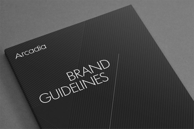
The ‘A’ has been crafted as a direct evolution of the identity’s existing symbol, maintaining equity whilst adding modernity and gravitas. The mark has individually crafted characters, simple geometric forms with confident angles derived from the equilateral form of the ‘A’. The existing Arcadia triangle is retained as a sign-off or stamp of excellence.
The colour palette references the industry’s mantra ‘Black is always in fashion.’ Contrast comes from the structured use of either of the two colour palettes – ‘vibrant’ or ‘muted.’ These palettes can complement seasonal trends within each of the brands.
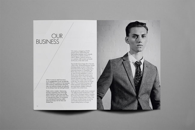
To give depth to the visual identity, we created a series of graphic textures, line details and photographic and typographic principles, all derived from the triangular DNA of the wordmark. The 30º angle suggests dynamism, encapsulating Arcadia’s future-focused model.


The website (www.arcadiagroup.co.uk) shows how the new visual identity system creates a backdrop for the Arcadia brands, whilst allowing them to share their individual stories. Best practice design templates were provided for stationery, business cards and internal presentation tools. We partnered with the group marketing team on spatial design concepts and press launch invites, and printed communications including magazines, annual reports and HR communications.





Moving Brands elsewhere on Identity Designed: CX, Watermark.
More from Moving Brands. Follow Moving Brands on Twitter.