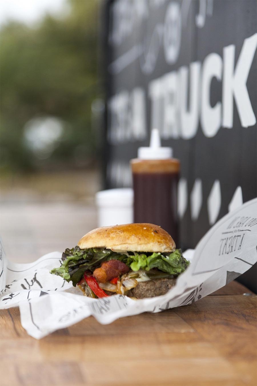
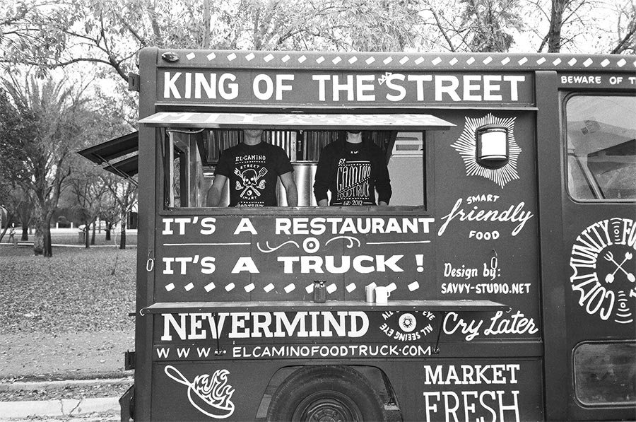
El Camino Foodtruck is our answer to Monterrey’s gastronomic needs. Its menu caters for all tastes, ranging from vegetarian options to delicious Texas-style hamburgers and sandwiches. The Spanish/English combination in its name is a play with words that aims to communicate these flavours.
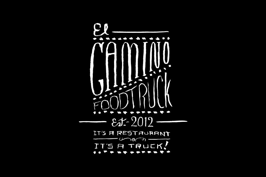

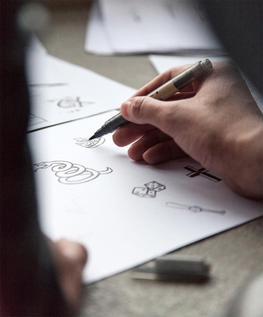
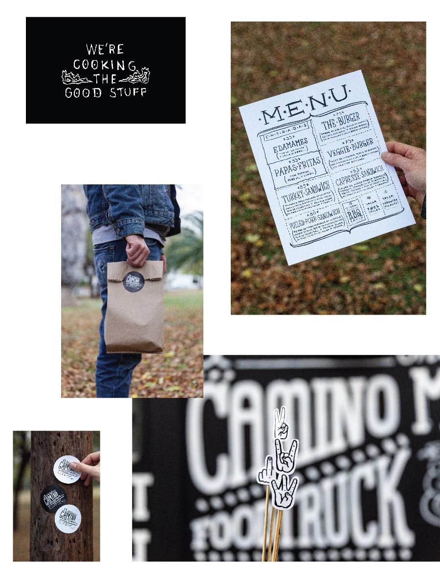
For this project we developed an exhaustive graphic language which is constantly growing. The aim is to make the Foodtruck very recognisable through its easily identifiable graphic style. Americana and biker tattoos are two strong influences, expressing the truck’s rough and Texan personality in an appealing way. El Camino Foodtruck is a tribute to an artisanal approach, from the meticulous preparation of the food it serves to the creation and implementation of its visual language that was conceived in pencil and paper and later hand drawn directly on the truck.





More from Savvy.



Comments
Damn—what’s not to love? Cool concept & great execution. If the food lives up to the hype then they’re in business!
I get the idea that the design wants to evoke a sense authenticity and simplicity but it has the opposite effect on me because it is neither simple nor using a contemporary technique but goes a long way to use retro techniques and styles. If you fake simplicity, what does that say about your supposedly simple food? I do appreciate that the design stands out.
I’m not sure simplicity was part of the brief, Christian. Seems like an artisanal approach was called for, and in that respect I reckon it’s a winner.
I agree that the hand-drawn graphics capture artisanship and a certain rough personality. When this was the brief it is clearly met and this is a job well done. My opinion above is probably a little unfair and I got carried away by a matter of taste for how a food truck or food service in 2015 should advertise for itself. My feeling was (and still is) that hand-drawn signage on chalk boards are fine but when this is cut from vinyl or mass printed on wrapping paper, while still giving the appearance of being hand-drawn, it undermines the authenticity of the drawing at least slightly. Hence, I would avoid this approach.
Christian–the designers may agree with you on that. Probably why this is all hand painted. Check out the video above. It’s impressive.
When biker tattoos are mentioned as a design influence — and what I imagine is a nod toward the customer base — I might well have come up with a somewhat similar outcome. I agree about the wrappers, though. I know inks are prevented from transfer to food, but when it’s black on white paper, and any grease shows up, might be hard not to think of contamination.
Bhadri, I thought so about the video, too. Nicely done.
I love the handmade style. A lovely project!
Fun and engaging. It certainly makes this independent food maker stand out from the crowd. I wonder what the food tastes like?
Really nice project, the only thing I could add to the comments above is that it is SO refreshing to see a client who obviously has the courage of his/her convictions. You have to be brave to go down this road I think and invest in an identity that sets you apart.