
The Institute for Sustainable Production (IPS) is a Spanish non-profit organisation created in 2011. Its aim is to promote a corporate culture of contributing to sustainable development from an economic, social, and environmental standpoint.
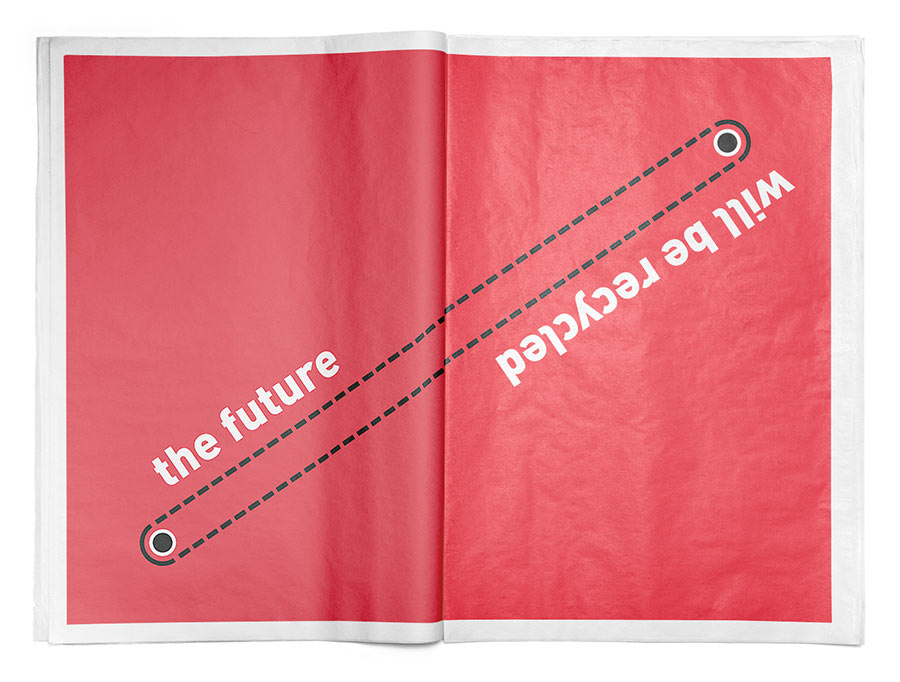
We were commissioned to create the IPS visual identity, and our task was to apply a sustainability idea to brand identity design. But how can a brand’s visual identity be sustainable? By making a flexible system that’s renewable, recyclable, reusable, and environmentally responsible.
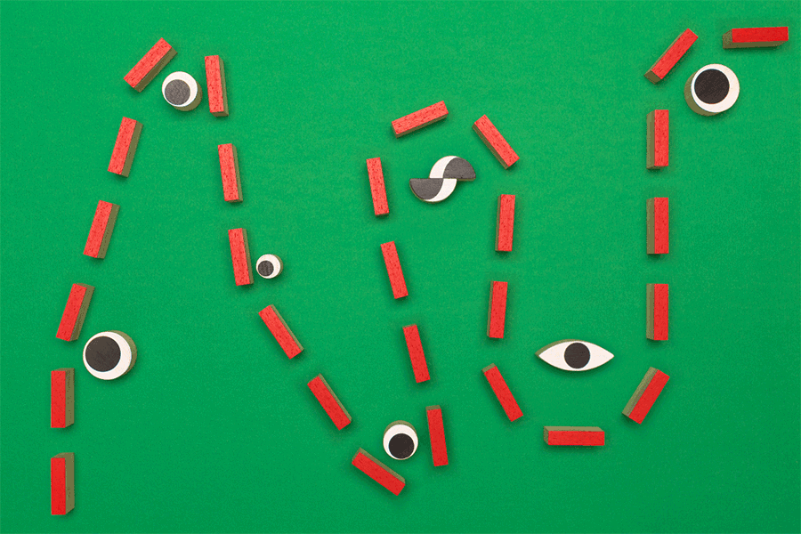
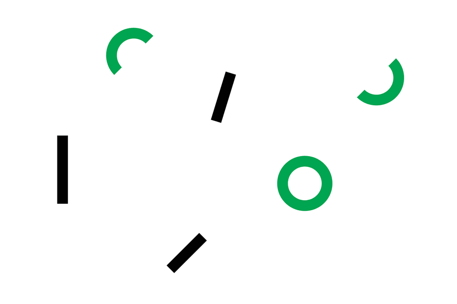
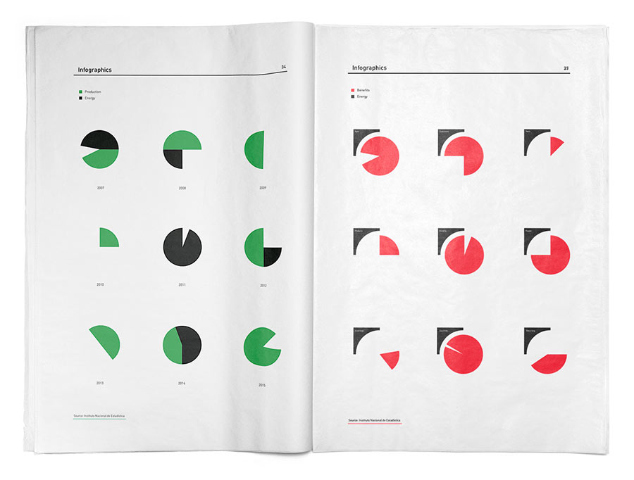
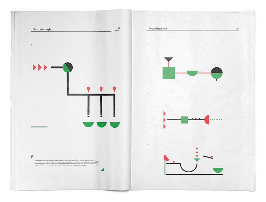
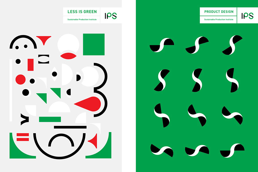
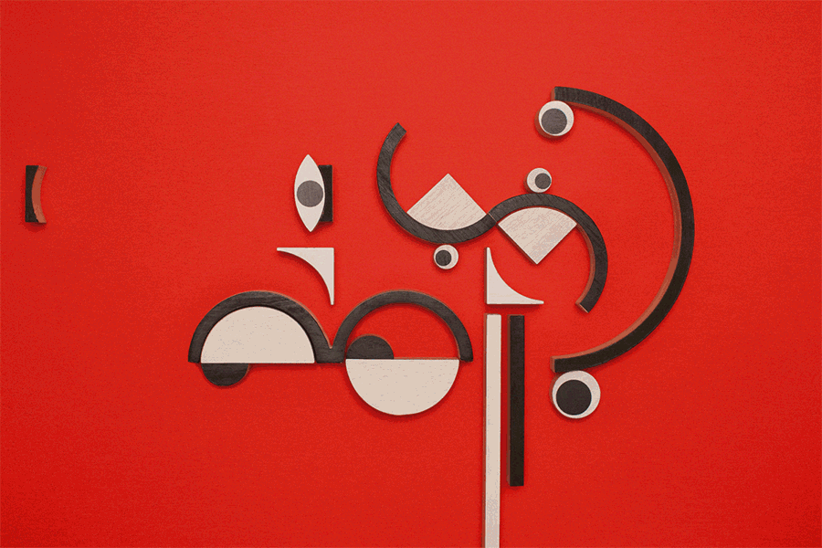
“To do more with less” is an important aspect of sustainability. That’s why this visual system has been designed from basic and combinable shapes, meaning the result is always simple and functional.

The system is recyclable because the same shape can be combined with others to create new shapes. It’s renewable because the ability to combine shapes allows the creation of multiple graphics. And it’s reusable because the same shape can be used on several occasions throughout the life of the brand.

By basing the visual system on geometry, the result is easy to understand and away from unnecessary frills, resulting in a sober and functional design.
The colour green represents the main feature of the brand: the ecological spirit. White and black add contrast and provide better readability in messages. Occasionally, red — synonymous with life and counterpoint to the main palette — can be used as a secondary tone when needed.
Designing with hands, the brand kit
The brand kit has three main tools, each made to help the client understand, generate, and apply the visual identity to countless media and formats.

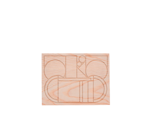
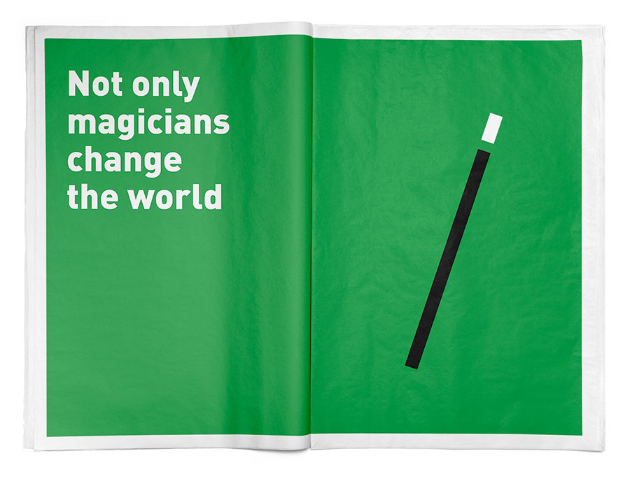
1/ BrandBox: It’s the main tool. These wooden pieces are made to play with by hand to easily generate new graphics. Wood was chosen because it’s a renewable raw material. Also, the act of creating new graphics is a sustainable act in itself because there’s no need for electricity, and no creation of waste.

2/ BrandApp: An app to convert physical graphics into a digital, ready-to-use file. Once the graphic is designed with the BrandBox shapes the app is used digitally reproduce it before exporting the file in several sizes and formats.
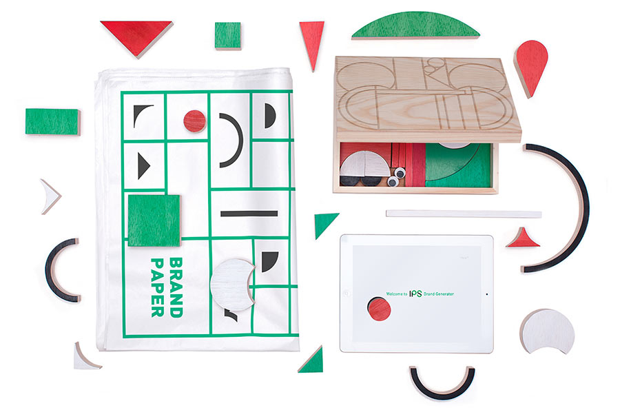
3/ BrandPaper: The new and sustainable version of the classic brand book. How to create graphics, motion graphics, or an illustrative style — everything is inside the BrandPaper. Printed with ecological inks and certified recycled paper in single sheets means it can be easily updated.


The main typeface is DIN, providing sober modernity and strong legibility in all weights.

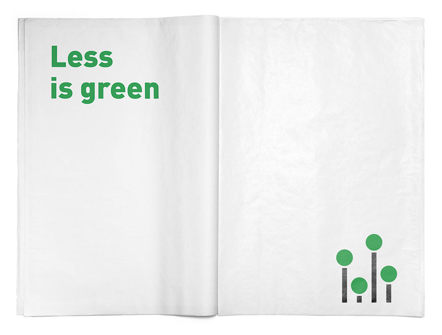
With this flexible visual system the brand can speak in different tones, depending on the needs of the message, but always defending its values. In short, we can define the project as “sustainable brand identity,” where each communication piece is recyclable, renewable, and reusable. Because when it’s about sustainability “less is green.”


More from Dosdecadatres.


Comments
This brand identity deserves many design awards for innovation and creativity, it’s truly awesome!
Nice words. Thank you so much Brian.
—
This is the best thing I’ve seen all year. Brilliant concept, execution, and presentation. Simply bravo!
Beautiful branding! Very playful and engaging. However, I do wonder how applicable “less is green” is, when they have double-spread ads with that much black ink…