Miriam Haskell opened her first boutique in New York City in 1926, creating and selling intricate, hand-crafted jewellery. Each piece is still created by hand today. Over the years, the company had been using two different logos: one based on Miriam’s signature, and the other a more generic, all-caps serif logotype.
![]() Old logos.
Old logos.
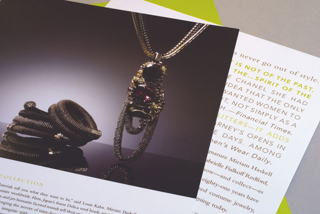
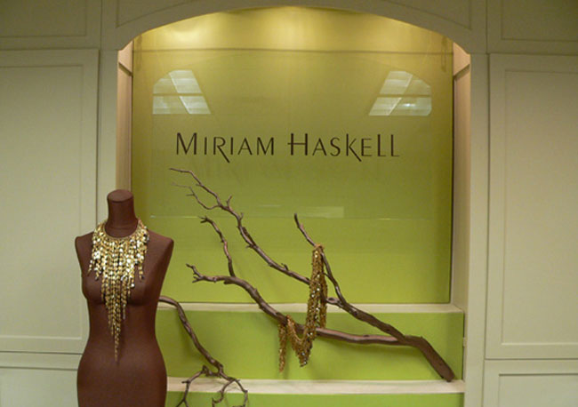
Think Studio was hired to freshen and re-focus the brand. We drew on the rich history, while helping to bring the look up to date. The design is simple, providing a nice contrast with the complex jewelry designs. Typographic details and the metallic bronze and bright chartreuse color palette help set the company apart from the competition, while giving all pieces a sophisticated, appropriate feel.
 Miriam Haskell’s new wordmark.


More from Think Studio.


Comments
I like the typeface. It has that thick to thin contrast that Bodoni has and that helps to keep a sans serif looking elegant. I love the bronze and green color palette, works great especially in the window frame photo. Off topic but does any one know the font used?
Thanks for the kind words, Michael–glad you like it. The logotype is based on Peignot, and has been modified. The other fonts in the program are Avenir and Bembo. Hope that helps-
I think it might be Peignot…http://new.myfonts.com/fonts/agfa/peignot/
I have a real soft spot for all-caps serif fonts, so the “CERTIFIED AUTHENTIC” image gives me goosebumps.
Really well handled word-mark, looks great in-press, might have been nice to have brought something back from the original identity but a fantastic resolution nonetheless.
Very nice! Loving the typeface, colour scheme, the whole lot! What a successful designed identity!