The brief was to develop a brand and identity for a modern Thai restaurant.
Brand
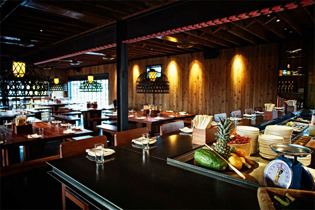
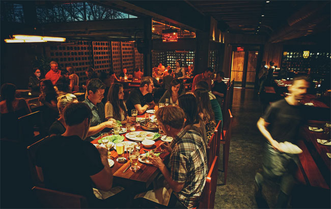
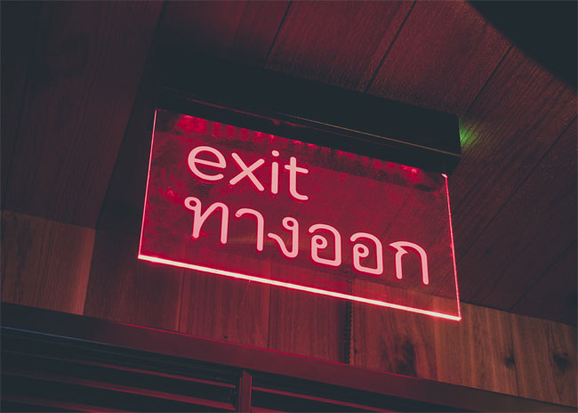
The swayเสวย brand reveals itself slowly; the same way that the enigmatic posture of the architecture conceals a space filled with warmth and family style eating.
Michael Hsu’s carefully crafted structure on south 1st street is dark, enigmatic, and starkly contemporary.
The minimal facade conceals the dazzling warmth and color of the dishes and food carefully prepared within by James Beard nominees Rene Ortiz and Laura Sawicki of La Condesa fame.
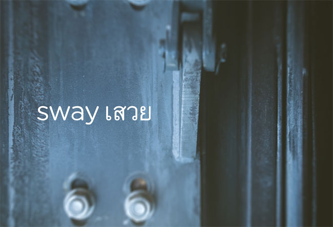
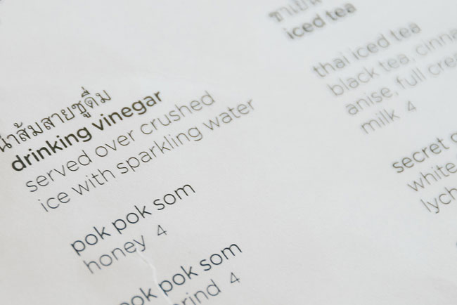
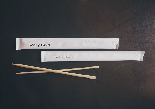
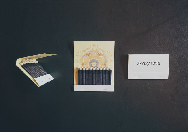
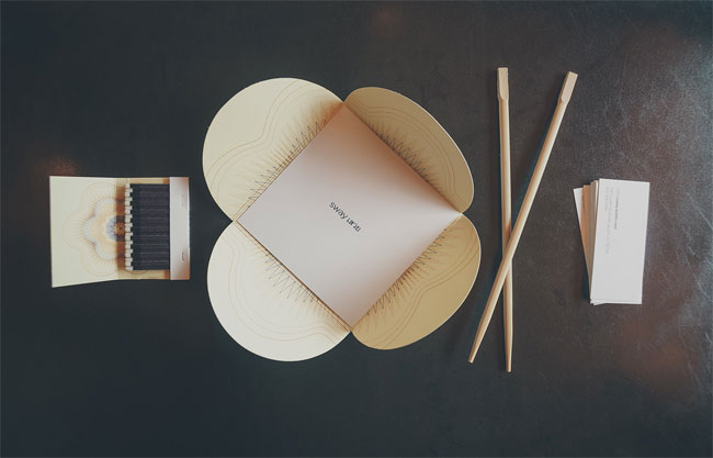
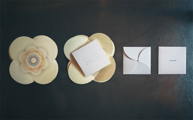
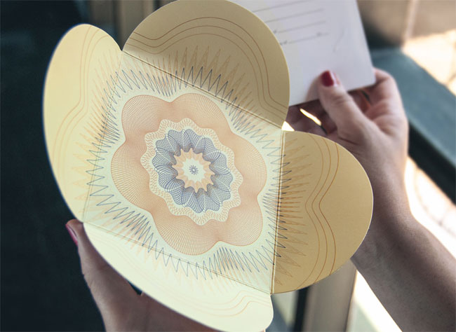
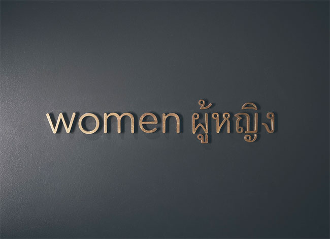
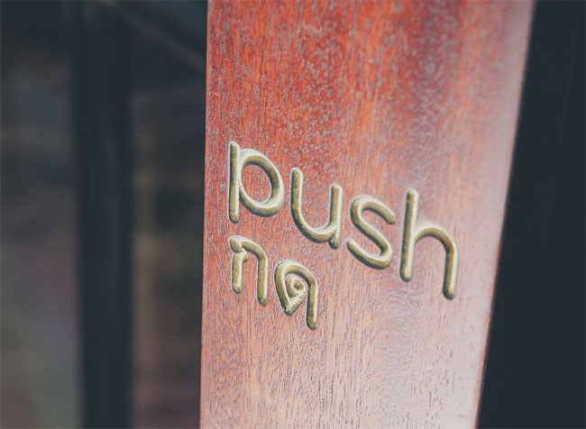
The brand and operational kit for swayเสวย works in a similar fashion: The brand is minimalist, using only subtle shifts in weight and language to demarcate spaces, food, and the name of the restaurant. However, like the flavor of the food and the interior design, the identity system also delights in unexpected explosions of color.
The elaborate, mathematical guillochés mimic the floral complexity of traditional phuang malai (พวงมาลัย) and appear when a coaster is used, matches are opened, or a gift certificate given.
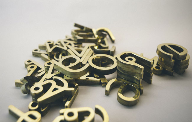
The typography is our own carefully customized version of Garuda, an open source face developed for the Thai NationalFont Project, paired with Gotham Rounded.
Thai language translations carefully provided by Pratana Klieopatinon, Professor at Chulalongkorn University, Bangkok.
Website by our friends at Guerilla Suit.


Creative director: Jett Butler
Designers: Emily Sawtelle, Dale Wallain, Jett Butler
Project manager: Lesley Taylor
Translator: Pratana Pat Klieopatinon, CU INDA
FÖDA elsewhere on Identity Designed: Michael Hsu Office of Architecture, Violet Crown Cinema.
More from FÖDA.
Comments
Jay! I like it and find the design inspiring especially given that many restaurants have sophisticated food and interiors but about average graphical designs and typography in particular. I would be curious to know what software was used for the guilloches. I find it further interesting that an open-source typeface was used; Gotham Rounded lacks for my taste the edges that add dynamism to a font but it matches Garuda well. My sense is that a few applications create effectively a distinct identity.
Very classy!
I am a Thai designer. There’s some mistake with Thai words, such as pull = ดึง, not ดิง, and push = ดัน or ผลัก, not กด if used for the door. And one thing that doesn’t match for a Thai restaurant is the chopstick because it’s never used for Thai food. You transform the object to match the idea.
phon, maybe I’m misunderstanding you, but I travel pretty often to Thailand… Bangkok and Phuket, and people use chopsticks to eat. I’ve always used them, and everybody around me uses them. So what do you mean when you say “it’s never used of Thai Food”?
I love everything about this. It was such a good idea to actually see the language of the type of restaurant being used. The overall mood and interior design makes me see this as actually being a restaurant that you would find in Thailand.