
A brand identity had to be created for The Halcyon, a new boutique hotel opening in the World Heritage City of Bath. There were no photographs of the hotel and its contemporary interior prior to the opening. The personality and impact of the brand was the sole driver of interest and tangible sales.

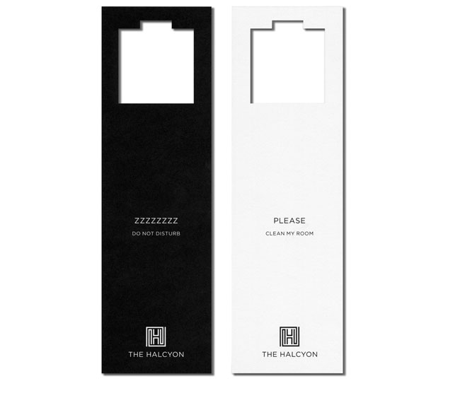
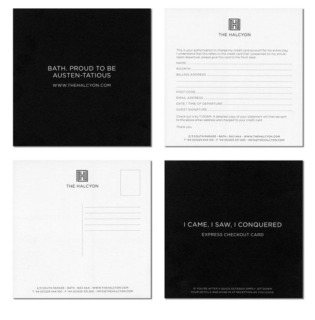
Our brief was to create a sharp, contemporary and fun identity catering for people who want the style and function of a luxury hotel at affordable prices. We created the brand identity featuring a highly individual tone of voice and applied it to the website, advertising material, hotel brochure and all internal and external signage.
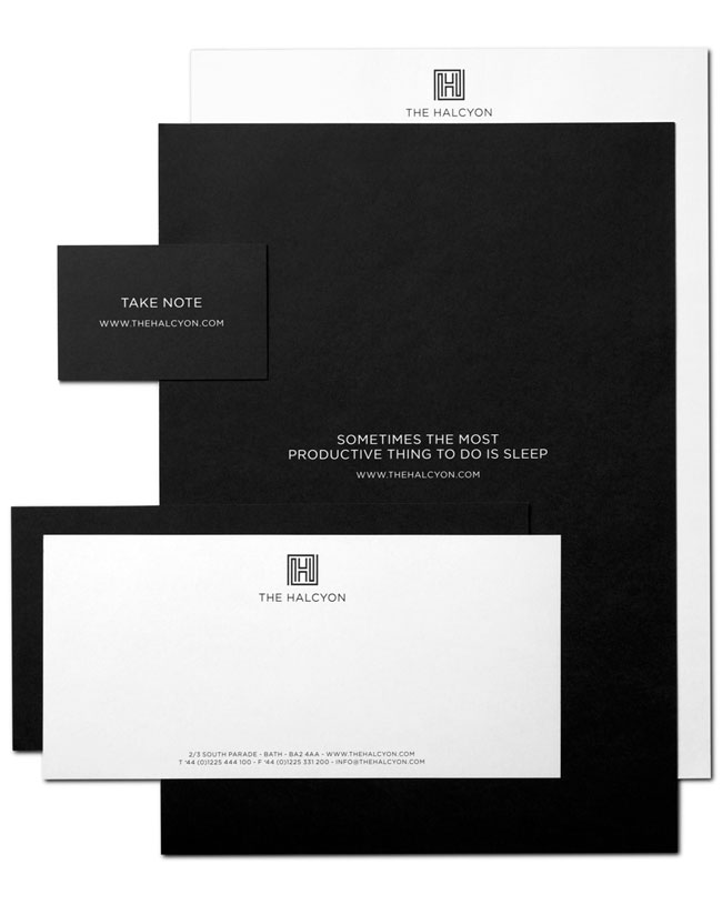
The new Halcyon logo was launched in August 2009. This was followed a few months later by an e-commerce website. No hotel photography was available therefore the site only be illustrated with simple line drawings and enhanced by evocative brand tone of voice copy.

The hotel opened in February 2010 with encouraging bookings including 90% occupancy for the first three weekends in February and 60% occupancy for the first three weeks including weekdays.

“All the interest and tangible sales had been achieved despite there being no photographs of the hotel and its contemporary interior. Mytton Williams created the perfect brand solution which, from day one, has driven both sales and hotel development ideas.”
— GILES THOMAS, THE HALCYON
Elsewhere on Identity Designed: Ink Copywriters.
View more identity work on the Mytton Williams website. Follow the team on Twitter.


Comments
Loved the logo and the copy – esp. ‘When in bath do as the Romans did.’
Haha, the ‘voice’ of this identity is lovely, brilliant work. =D
omG! It’s really exciting to see how the minimalism used in this corporate identity can make me feel comfortable. A good client as well.
Really consistent application. I’m always a fan of succinct communication with a bold appearance. Job well done.
Thanks a lot guys, really appreciated.
Keith
What a nice treat to wake up and start my day with an email featuring this brand identity. Such beautiful minimalism. After being entranced by the logo, the clever tag line “When in Bath do as the Romans did” caught my attention and guided me through the rest of the material. I can see why this was successful despite no pictures of the hotel interior being made available before the opening.
Thank you for sharing. I’m feeling inspired.
The actual logo mark reminds me of the hallways in a hotel. Definitely a clean, luxurious feel to the brand. Great work!
I like it. The fact that the hotels occupancy rate was so high despite there being no photography, tells us a lot about this branding.
This works brilliantly from the design to the copy. Amazing that you can get a good idea of what to expect without actually seeing the hotel.
Beautiful identity! This is going to sound pretty newbish, but what font was used here? I’ve been trying to find that font for quite a while now. Thank you!
Joshua, the typeface is Gotham from HFJ — http://www.typography.com/fonts/font_overview.php?productLineID=100008